Back
BackOverview
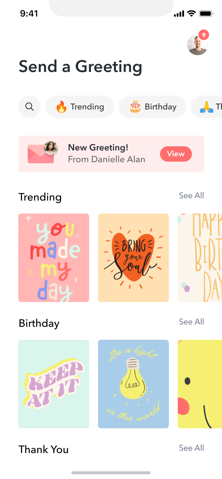
Tribute had built a strong reputation for group video montages, but the product only served one use case: many people contributing to one recipient. In 2022, we saw an opportunity to extend into one-to-one digital gifting and greetings — letting a single person send a personalized video message paired with a curated gift. This was Tribute Greetings: a new product built from scratch, launched across web, iOS, and Android.
Problem
Most digital greeting and gift card products felt transactional. You pick a card, maybe type a message, and send it. The experience didn’t carry any of the emotional weight that physical cards or in-person celebrations do. Tribute’s core product proved that video changed that equation — people responded to seeing and hearing from someone they care about. The question was whether we could bring that same feeling to a simpler, one-to-one format.
Solution
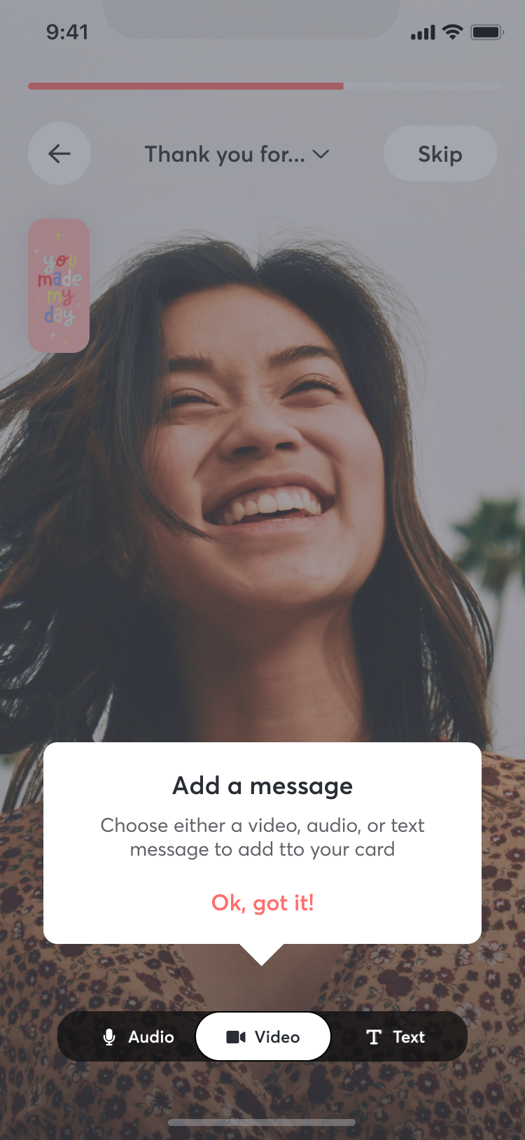
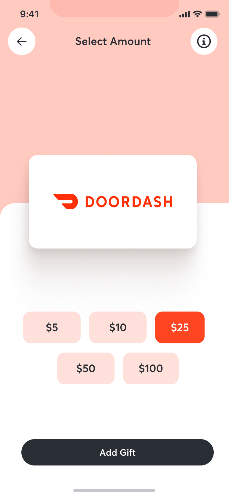
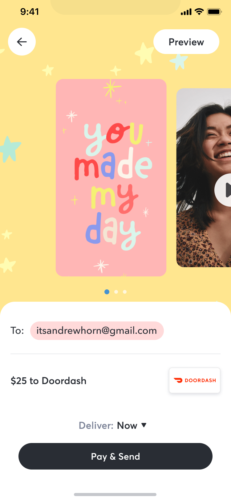
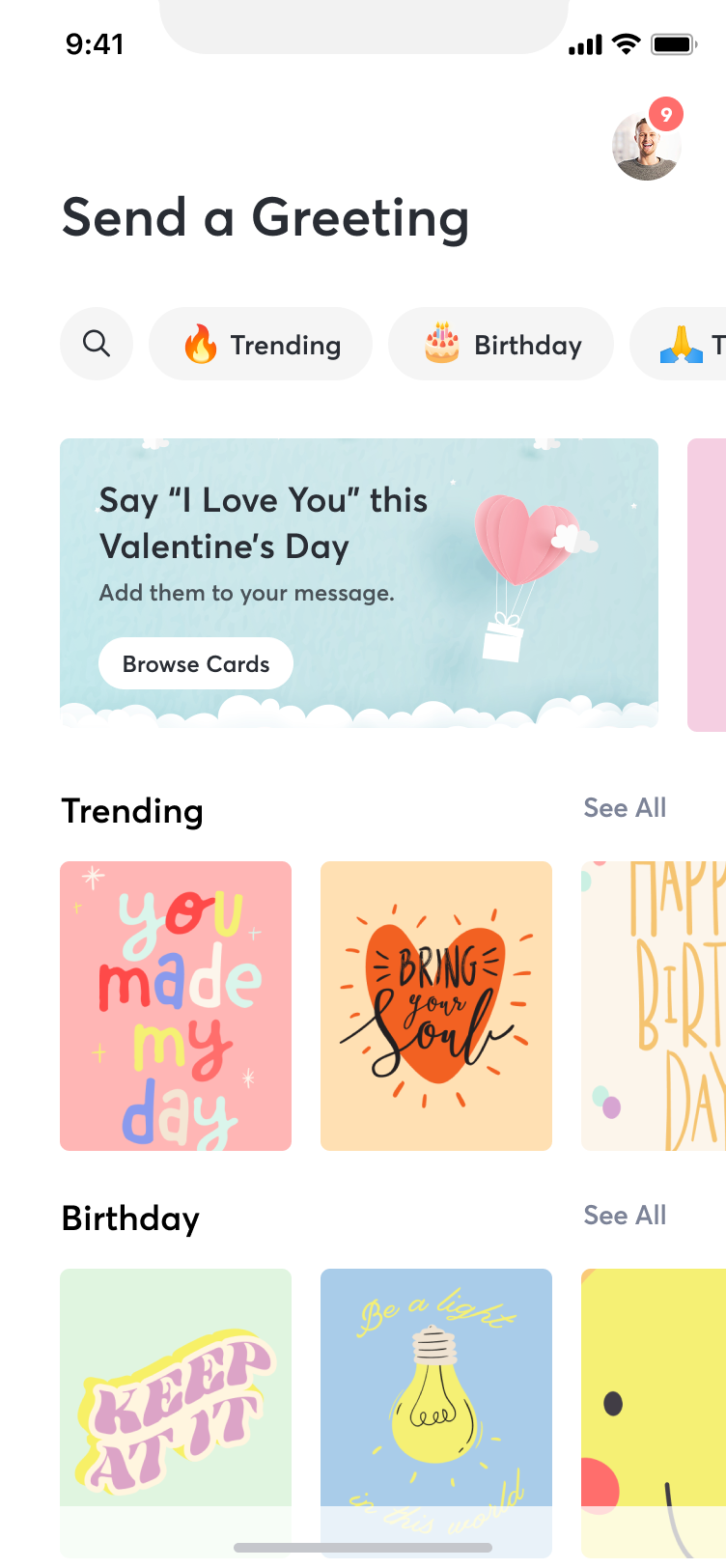
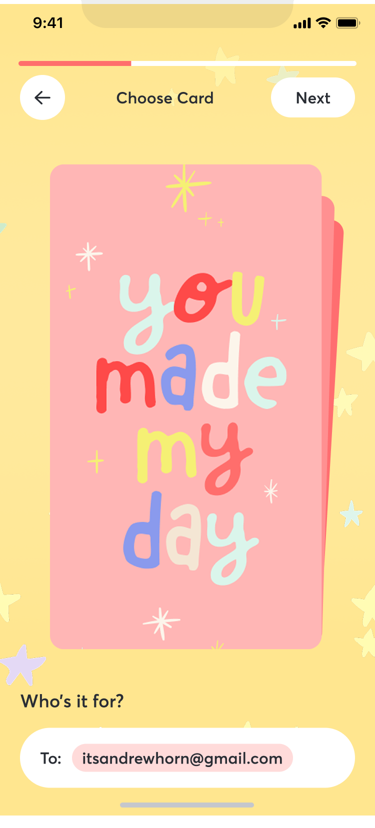
Tribute Greetings paired personalized video messages with curated gifts in a single, sendable package. The core features:
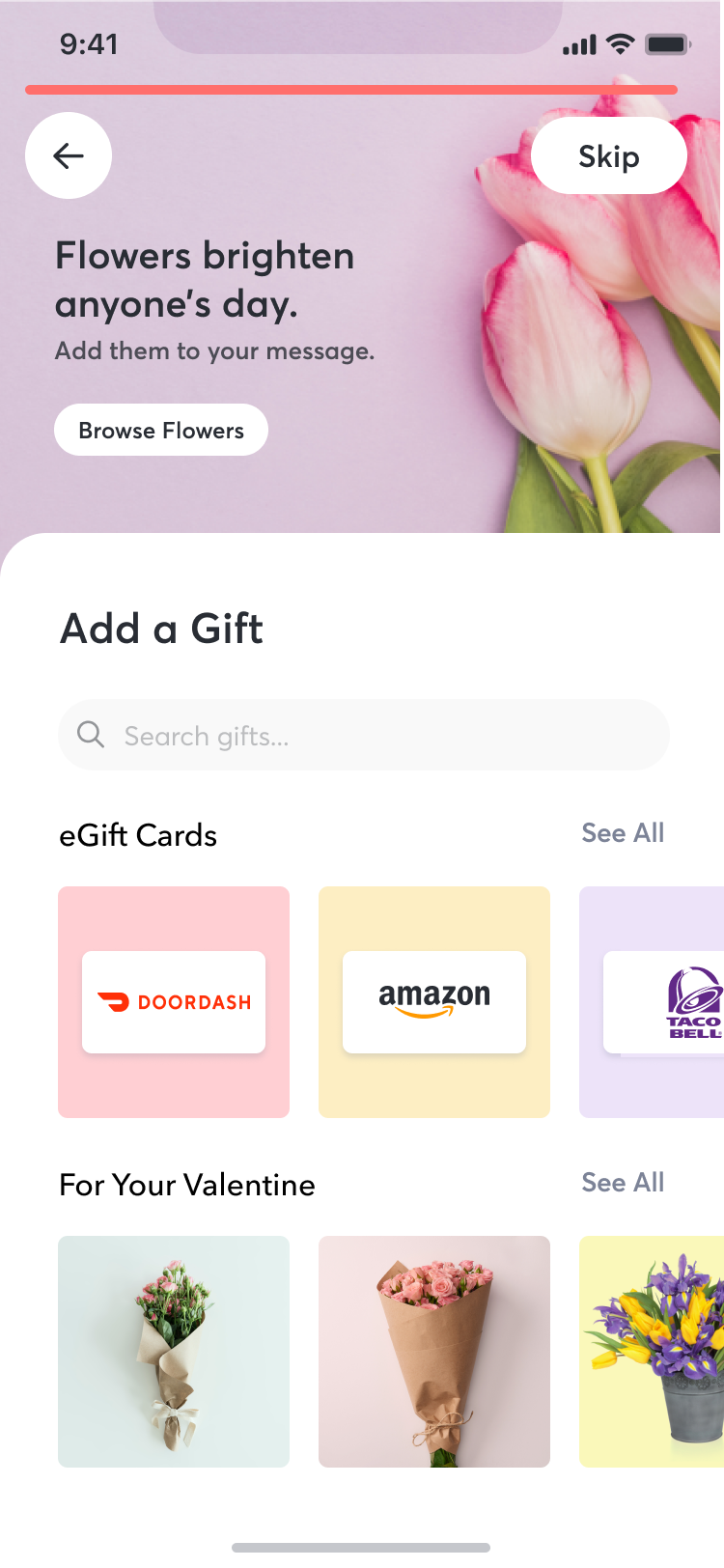
- Curated gifts: Gift cards, flowers, and artisanal products — options with more personality than a standard e-gift card.
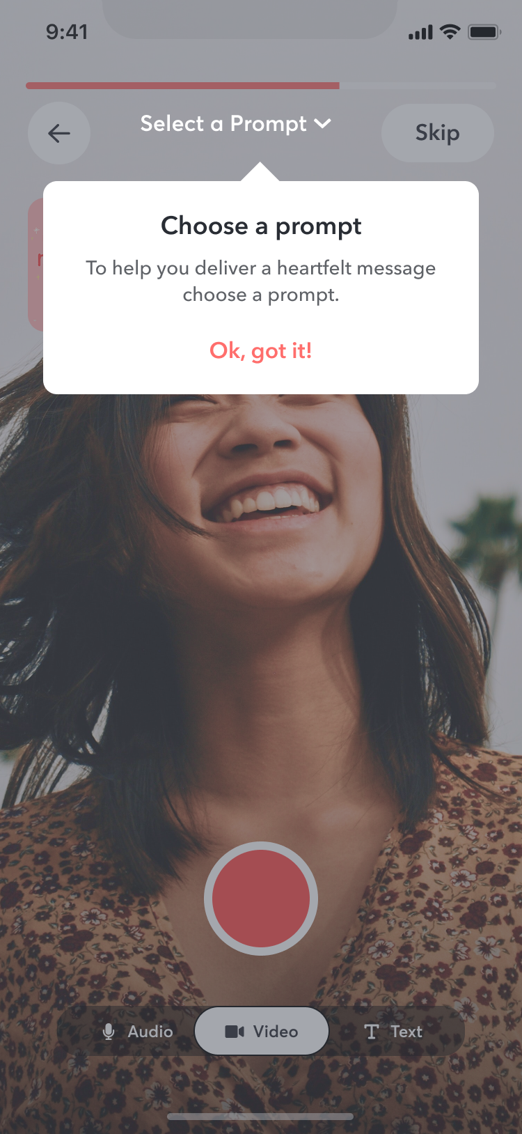
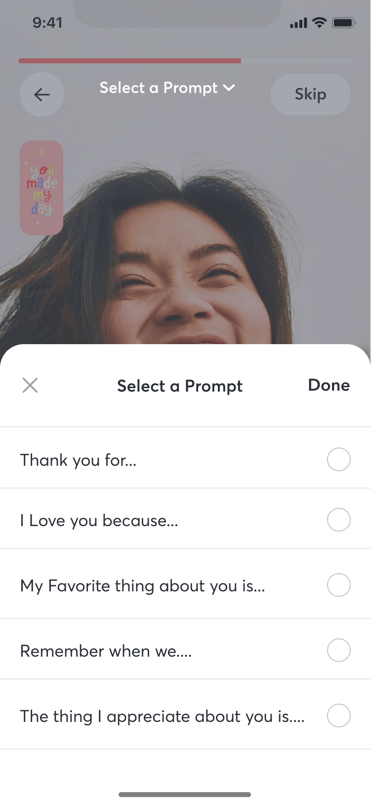
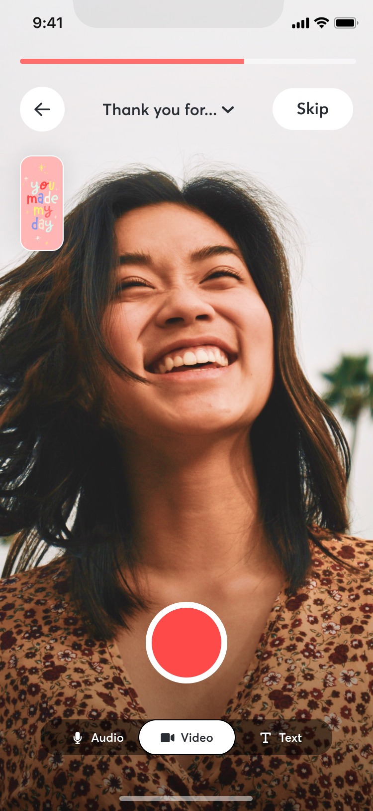
- Prompt cards: Short prompts to help people figure out what to say. This addressed a real barrier we saw in research — many users wanted to send something personal but froze when faced with a blank text field.
- Group gifting: Multiple contributors could add to a single greeting, bringing over the collaborative energy from Tribute’s core product.
User Research
We ran a research study with 300 participants across a range of age groups and locations, using a mix of moderated sessions (via Lookback and PlaybookUX, 30-60 minutes each) and unmoderated sessions for flow testing, card sorting, and tree testing. Everything was synthesized in Dovetail.
Three things came through clearly:
- Users wanted one-to-one gifting. The group format was great for milestones, but people also wanted to send something personal from just them. This validated the core product hypothesis.
- Simplicity over features. Users consistently preferred clean, uncluttered interfaces. They didn’t want to learn a new system to send a greeting.
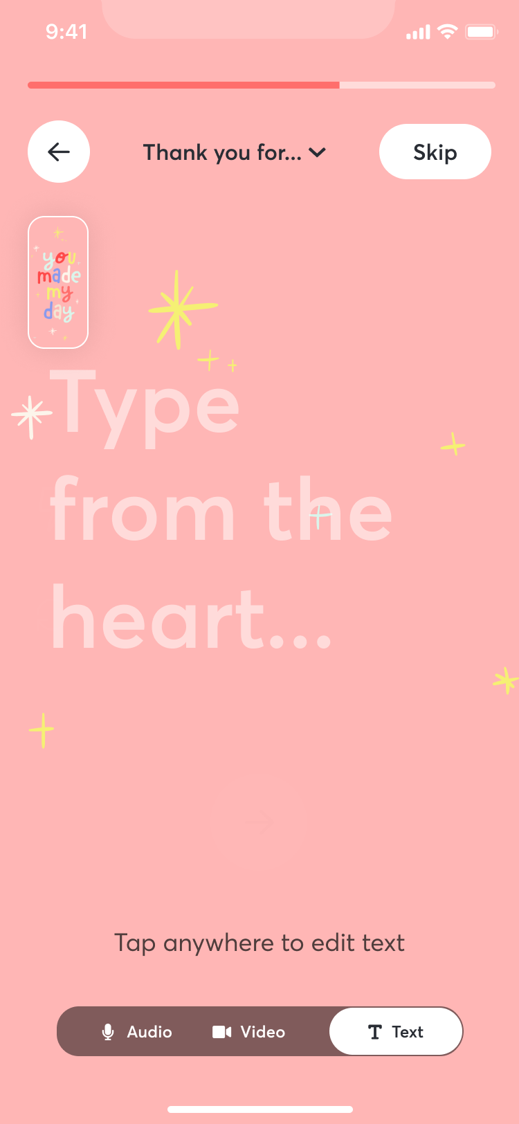
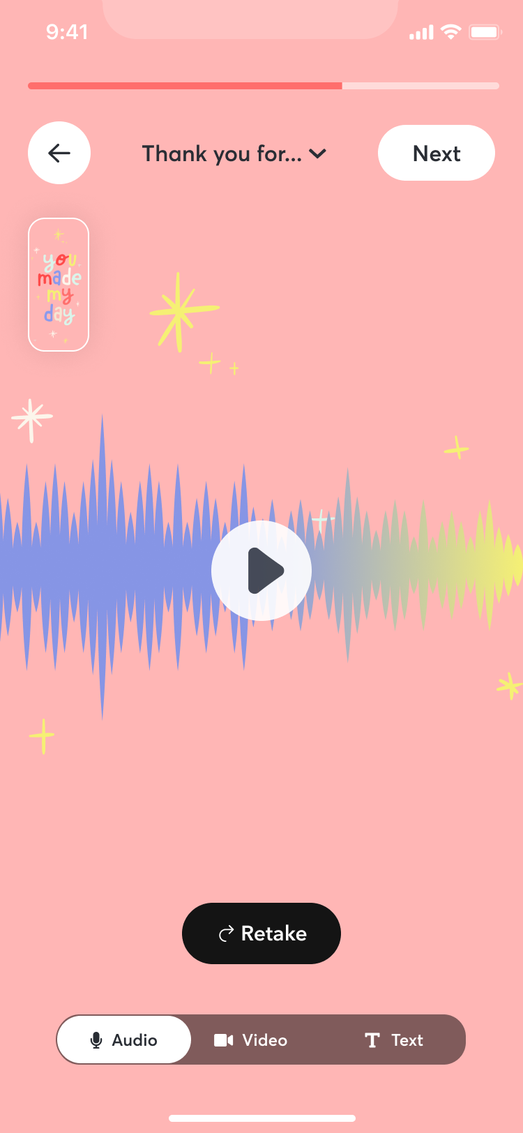
- Multiple input formats. Text, video, and audio all had demand. People wanted to express themselves in whatever way felt natural.
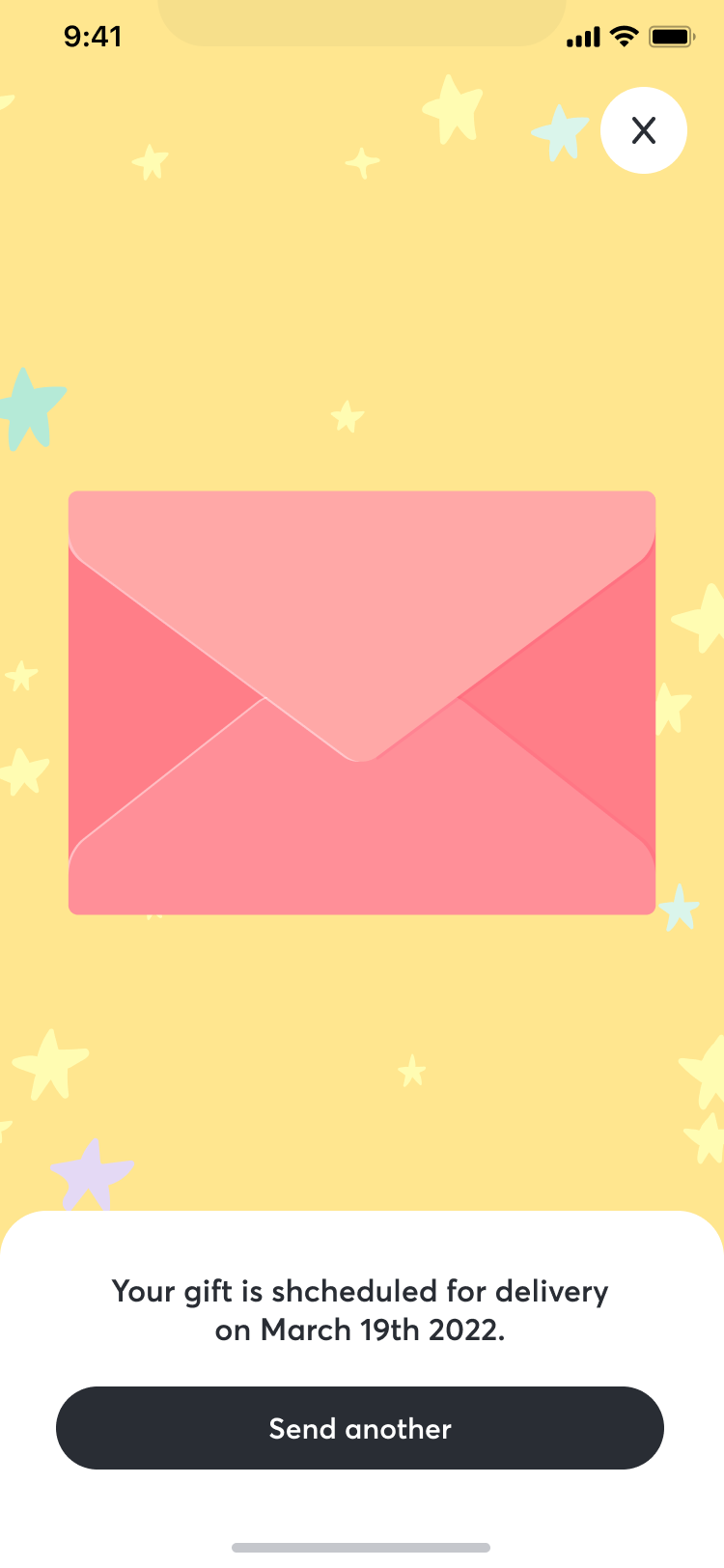
A few other findings shaped specific features: users wanted to schedule greetings in advance (which led to the reminders feature), and delivery preferences split between email and SMS (so we supported both).
Design
We mapped the initial flows and architecture in FigJam, then moved into weekly design sprints. I was directing two designers through this process while also doing hands-on design work myself.
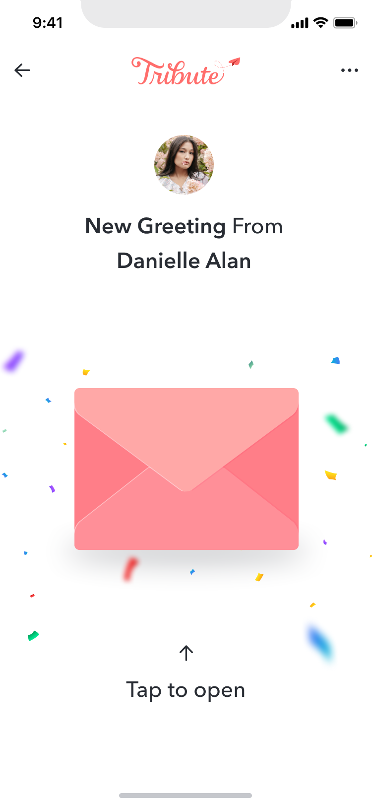
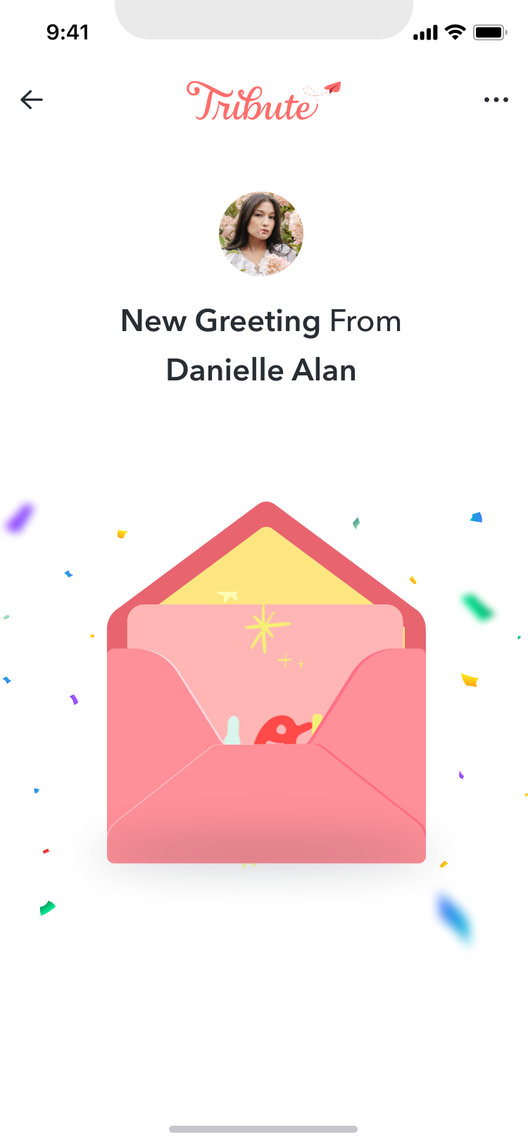
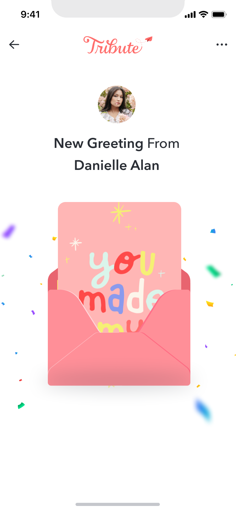
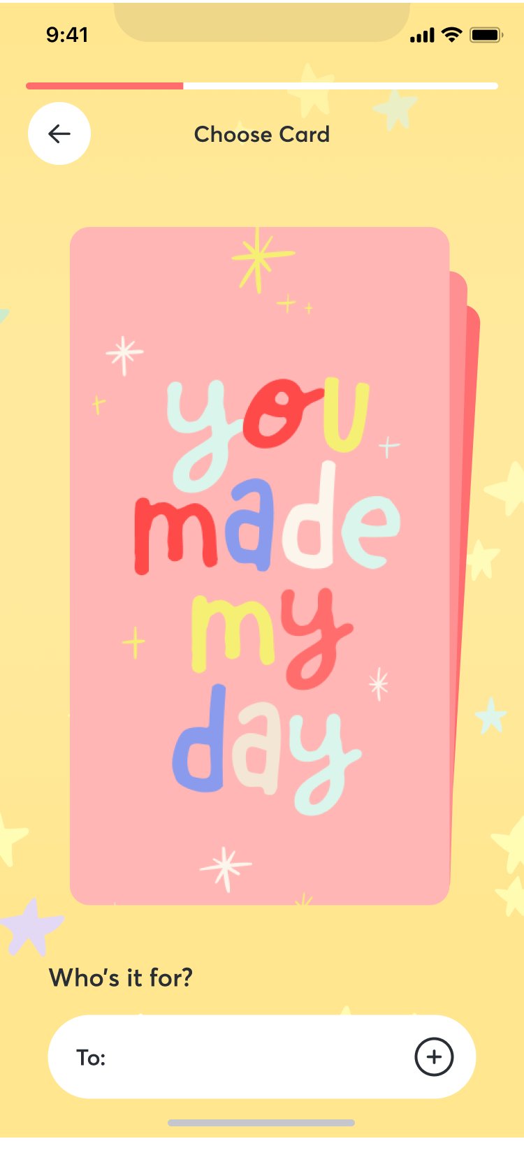
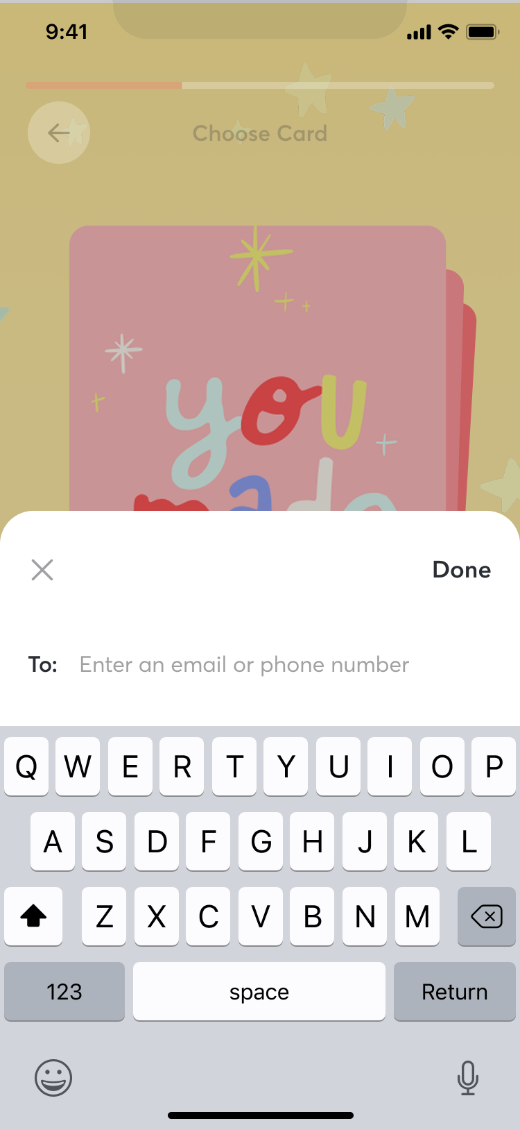
The app had two primary flows — sending and receiving — and we kept each one as linear as possible. The sending flow walked users through recipient details, message creation (text, video, or audio), gift selection, and scheduling. The receiving flow used a story-player format inspired by Instagram and Snapchat stories, giving recipients a familiar way to experience what they’d been sent. We also built in a reminders feature so users could set up greetings ahead of time and not miss the occasion.
Sprint exercises like Crazy Eights helped us generate options fast, but the real value was in the constraints they created. With a tight timeline, we needed to make decisions quickly and move on rather than endlessly iterating in Figma.
Validation testing
Once we had high-fidelity designs, we ran unmoderated task-based testing through Maze, recruiting from Tribute’s existing base of 2 million creators via email. These were users who knew the Tribute brand but had never seen Greetings, which made them a good proxy for the real launch audience.
The most important finding was something we got wrong. We’d assumed audio features and social network integrations would be strong draws. Users didn’t care. What they wanted was simplicity — a direct path from “I want to send something” to “it’s sent.” The social connectivity options actually created frustration; people felt overwhelmed by the number of sharing options.
That result led us to strip features from the roadmap rather than add them. We cut the social integrations, deprioritized audio, and simplified the send flow. It was the right call — the strongest version of the product was the simplest one.
Building it
We had a two-month development window. The strategy was to build for web first using Ionic, Vue.js, and Tailwind, then extend to iOS and Android without rewriting the core. The team hadn’t used Ionic before (I’d used an older version), so there was a learning curve, but the tradeoff was worth it — one codebase across three platforms.
A few decisions paid off early. We reused authentication, sign-in, and marketplace code from the existing Tribute site, which cut development time significantly. Launching as a web app first under the Tribute domain meant we inherited the site’s SEO and avoided app store review delays and in-app purchase fees during the initial launch window. Storybook kept our components documented and consistent as the team moved fast.
The rollout was phased: web first (Django backend, DRF APIs, Ionic/Vue frontend), then iOS with a native auth flow and reworked marketplace UI, with Android planned based on results from the first two.
Reflection
Greetings was the first time we built a new product from scratch at Tribute rather than iterating on the existing one. The biggest lesson was about restraint. Our instinct was to pack the product with features — audio, social sharing, multiple input formats — because we had the research showing interest in all of them. But the validation testing made it clear that the strongest version was the simplest one. Every feature we cut made the core experience stronger.
If I were doing this again, I’d run the Maze validation earlier in the process, before we’d invested design time in features like social integrations that ultimately got cut. We would have saved weeks.