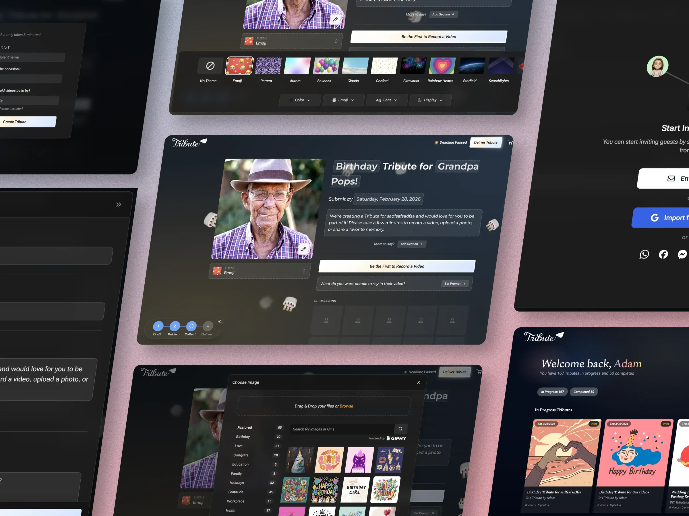
Tribute V3 · 2025
Re-architecting a decade-old platform
Ten years of band-aids, rebuilt in three months by a team of four — with functioning code as the deliverable instead of Figma files.
- Role
- Head of Product Design
- Scope
- End-to-end platform redesign (web-first, mobile-led)
- Team
- Design, frontend, backend — team of four, one-week sprint cycles
- Timeline
- ~3 months from concept to launch
Impact
Starts up 29%, purchases up 19%
Start-to-publish conversion rose 24% and CSAT 20%, with participant engagement up 10%.
Onboarding conversion ~25% → 54%
More than double the historical baseline, from a flow that had been a homemade Typeform.
Figma stopped being the source of truth
The deliverable became working code, grounded in a DaisyUI token system an AI agent can read. One-week sprints became normal.
Background
At the start of 2025, it was clear the Tribute platform had reached a breaking point.
What began nearly ten years earlier as a small side project had grown into an emotionally meaningful product used by millions. However, the foundation had not kept pace with that growth. Over time, we made incremental improvements to individual areas—authentication, recording, public viewing—but the overall experience from onboarding to checkout and delivery felt fragmented, outdated, and increasingly fragile. Band-aids were starting to fall off.
Tribute V3 was not a visual refresh. It was a full re-architecture of how creators and participants experience the product, how customization works, and how the platform could evolve moving forward.
Three things holding the platform back
Fragmented, aging flows
Nearly every major surface needed attention:
- Onboarding
- Publishing
- Tribute management
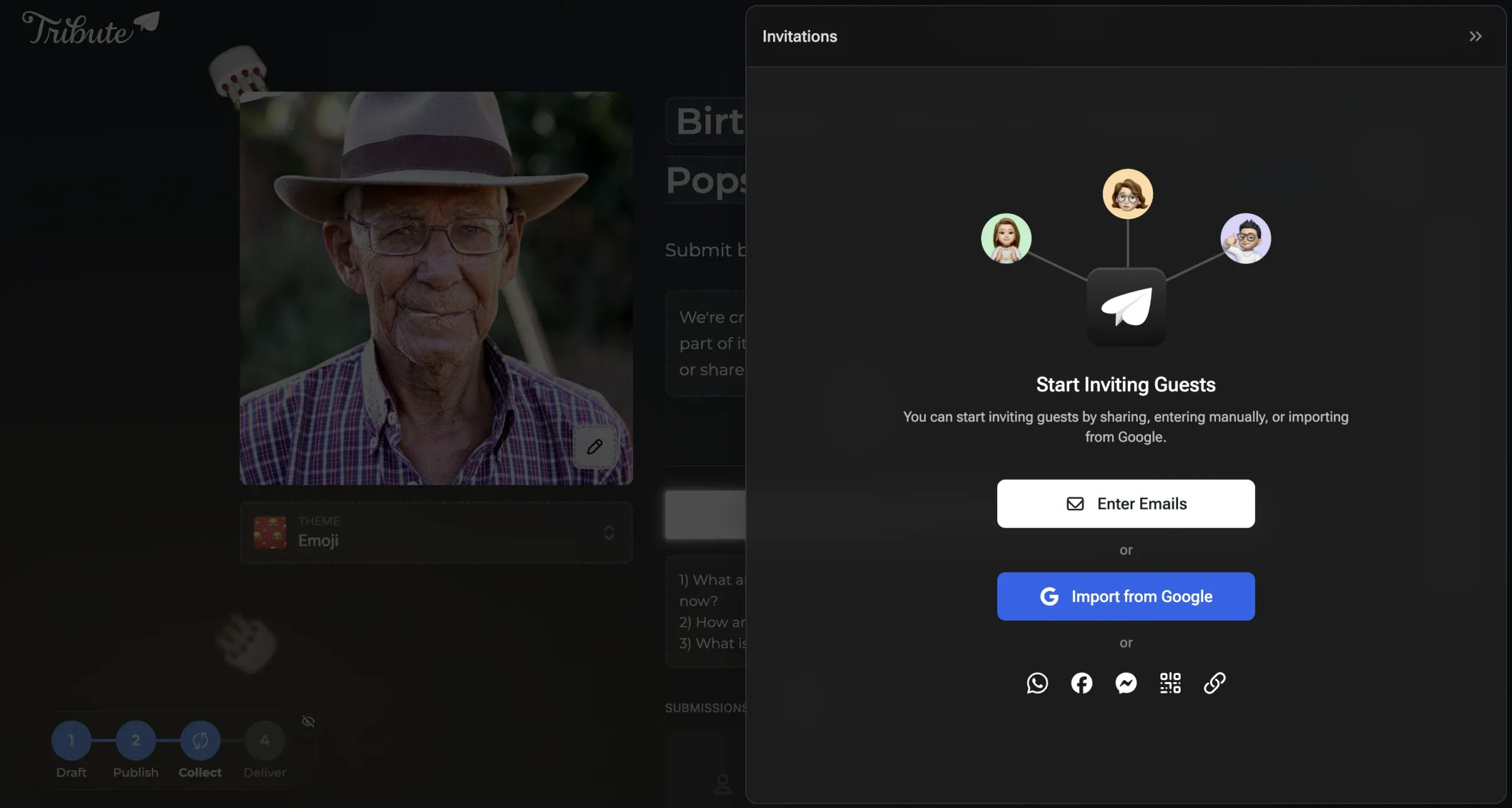
- Guest invitations
- Video editing and arrangement
- Checkout
- The completed Tribute experience
Each flow had been improved separately over the years, resulting in an experience that felt inconsistent to users and increasingly difficult to maintain internally.
Limited creative control
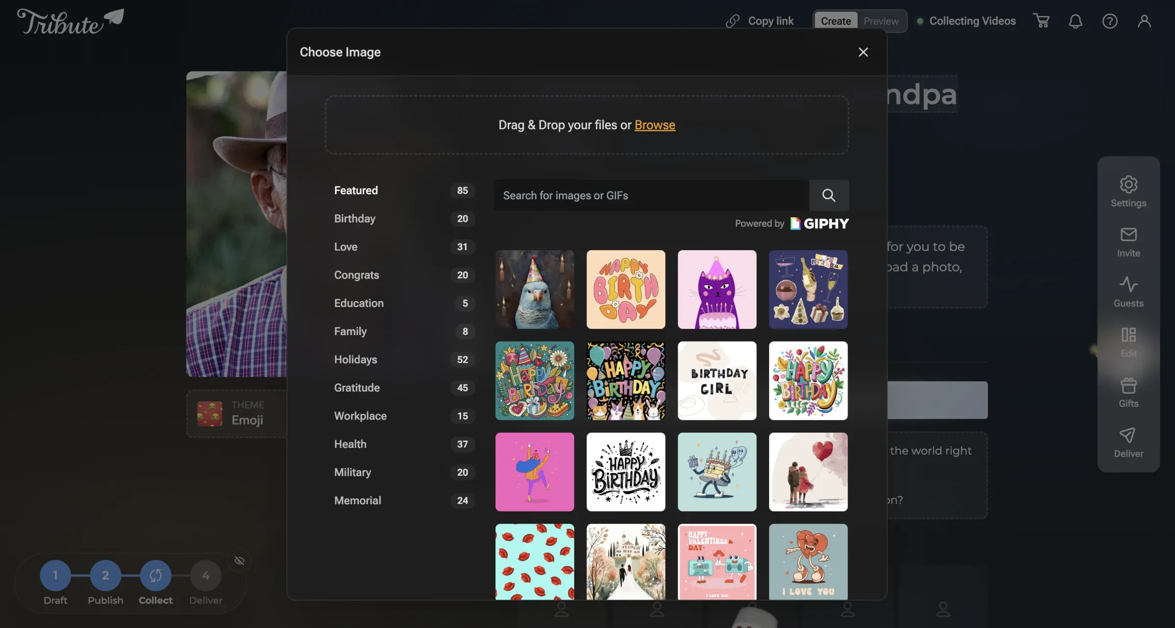
People use Tribute for retirements, memorials, birthdays—moments that carry real weight. Yet customization felt rigid. Users frequently asked for more control over themes, colors, and personality. The product didn’t reflect the emotional weight it carried.
Artificial separation between creators and participants
Creators and participants were effectively using different products. This fractured experience caused confusion, inconsistent UI patterns, and a loss of shared context. We looked to products like Partiful and Paperless Post, which treat creators and guests as collaborators in the same space, differentiated by permissions rather than separate interfaces.
The Vision
The V3 vision crystallized around a few guiding principles:
- One shared interface, different permissions. Creators and participants should experience the same product, with editing and management tools revealed only when appropriate.
- Customization as a first-class feature. Themes, colors, and visual expression should not feel like add-ons. They should be part of the main experience.
- Delight without complexity. Onboarding needed to be fun, expressive, and confidence-building without overwhelming users.
- Mobile is not a fallback. Mobile needed to feel intentional, polished, and fast — not like a weaker version of the desktop experience.
Early sketches and structural exploration
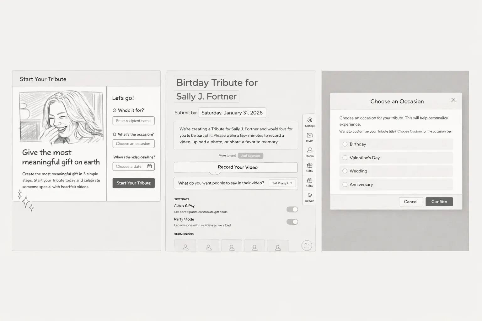
Before committing to layouts or interaction patterns, I explored multiple structural directions through rough sketches and low-fidelity wireframes.
These early concepts focused on:
- How creation, customization, and management could live in a single shared space
- How much context to show upfront versus progressively
- Where emotional expression (themes, tone, celebration) should appear in the flow
To move quickly and explore more surface area, several of these sketches were digitally enhanced and expanded using AI-assisted tools. This allowed me to iterate on layout variations, spacing, and hierarchy without prematurely locking into a single direction.
Importantly, these were not treated as final designs. They were thinking tools—used to test structure, discuss tradeoffs with engineering, and identify patterns worth validating with users.
The strongest ideas from this phase informed the directions that were later validated through ranking exercises, false-door testing, and interactive prototypes.
Sitemaps and wireframes with Relume
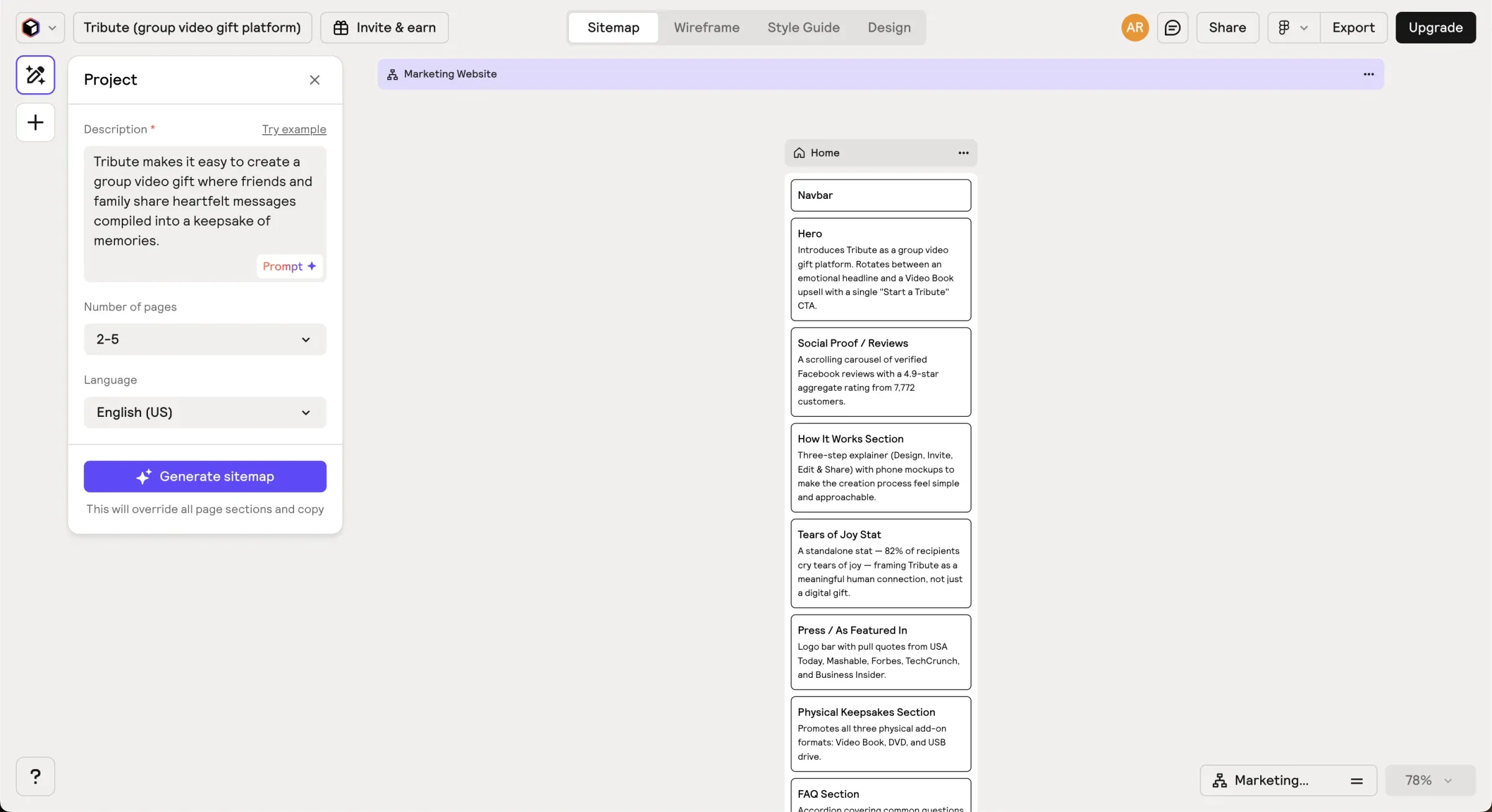
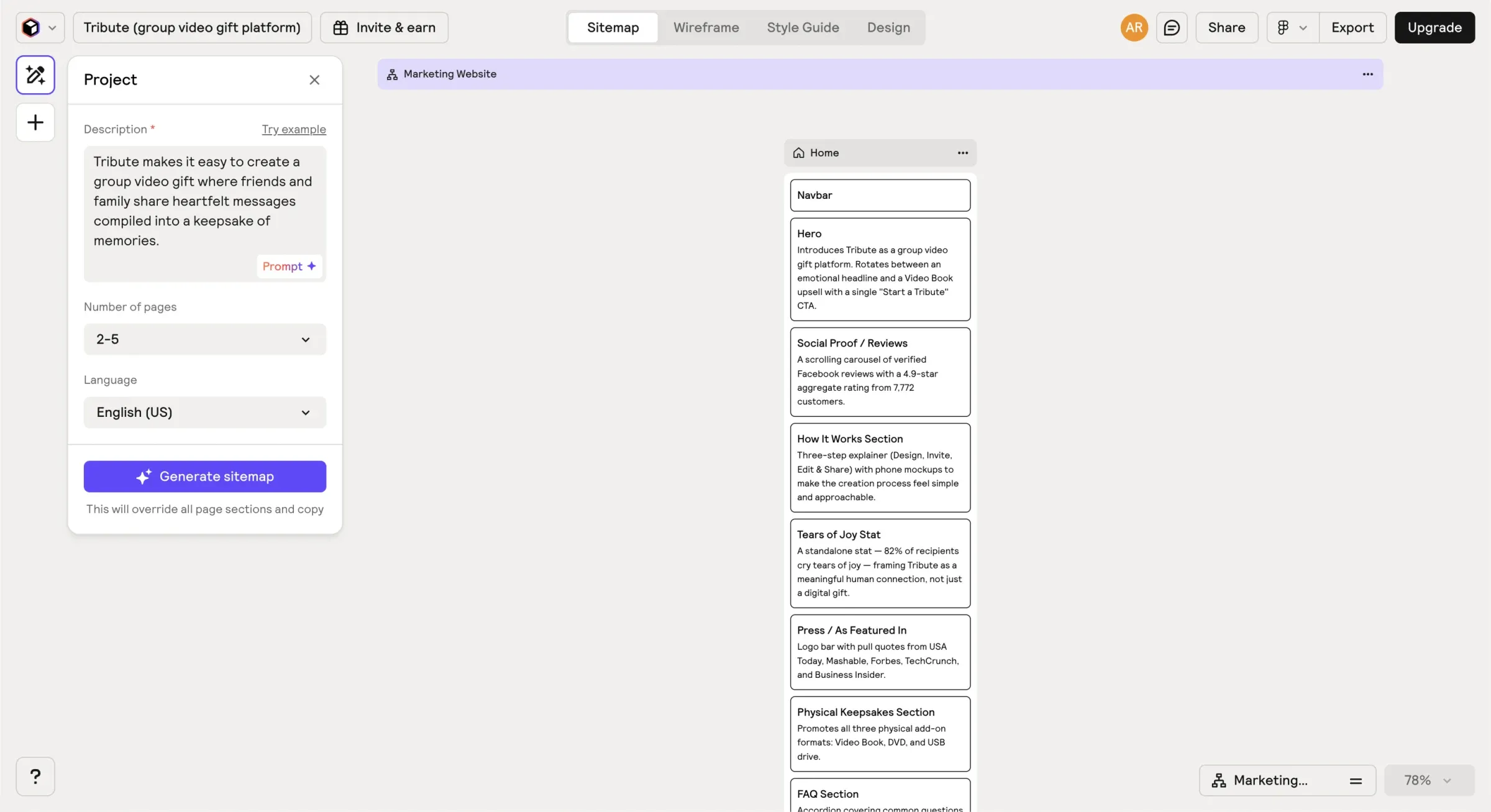
Mapping the full information architecture of a platform this large could easily eat a week. Relume’s AI sitemap generator let me describe the product in plain language and get back a structured, editable site map almost instantly—which meant I could decide on the marketing site structure, Occasions taxonomy, and How It Works flow in a single afternoon instead of iterating across multiple sessions.
The same was true for wireframes. Relume’s component library is built around real UI patterns, not abstract boxes, so the wireframes we generated actually communicated intent. Engineers could read them. Stakeholders could react to them.
Because Relume outputs directly to Figma, the transition from sitemap to wireframe to high-fidelity was one continuous file rather than a series of format conversions.
What actually mattered to people
Before jumping to solutions, I needed to understand how people mentally approached creating a tribute—and what actually mattered to them in the process.
Journey mapping and competitive teardown
I spent an intensive afternoon breaking down products like Partiful and Paperless Post, mapping their journeys from creation to completion. I focused on decision points, emotional highs and lows, and moments of friction.
A clear pattern emerged: the strongest experiences felt like one continuous space that subtly adapted based on who you were and what you could do.
That insight drove our core decisions: a unified space for creators and participants, differentiated by permissions rather than separate interfaces.
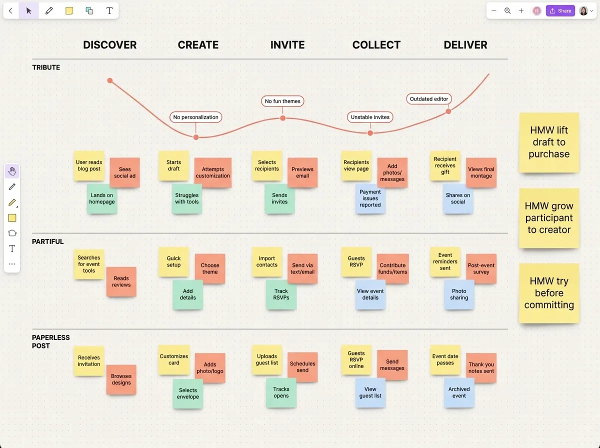
The map is also where the payment question surfaced. “How might we let people try before committing?” and “How might we lift draft-to-purchase?” sat on the board for weeks before they turned into the pricing decision further down this page.
Prioritizing what matters through ranking exercises
Rather than relying on assumptions or feature checklists, we ran a contextual feature-ranking exercise using Maze. Participants were asked to imagine creating a tribute for someone important and rank core features by importance during creation.
The features included:
- Video messages
- Theme and visual customization
- Music
- Ordering and editing content
- Cover text and messaging
This forced tradeoffs and gave us a clearer signal than grouping alone.
Several patterns stood out:
- Video messages were consistently the primary driver of value
- Customization ranked higher than expected, reinforcing emotional expression as core
- Structural features mattered, but users expected them to stay out of the way
These rankings directly informed visual hierarchy, default emphasis, and which controls were surfaced early versus deferred.
Testing early assumptions
One early idea didn’t hold up.
Inspired by Partiful, I initially wanted the product page—with placeholder data—to be the create experience. It looked slick and modern, but false-door testing and moderated interviews revealed confusion. Users weren’t sure what to do next or whether they were “doing it right.”
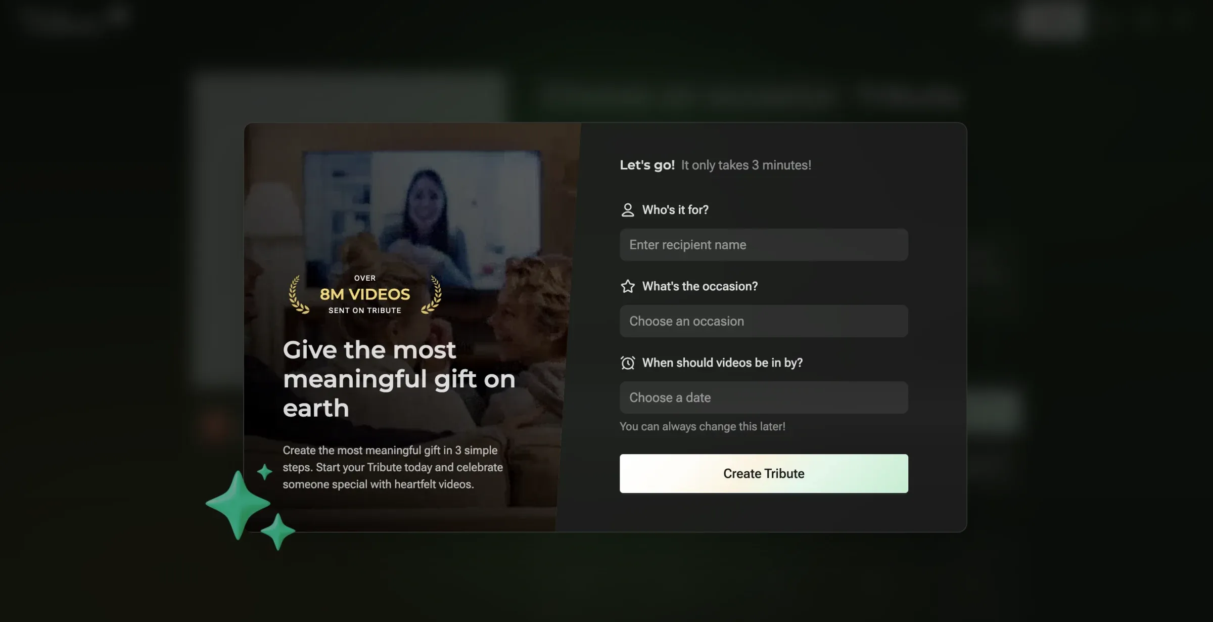
We pivoted to a more conventional modal-based start, with the new experience blurred behind it as a teaser. This preserved clarity while still signaling what users were about to unlock.
Shaping the Experience
With direction validated, the focus shifted to shaping the experience and testing it in increasingly concrete ways.
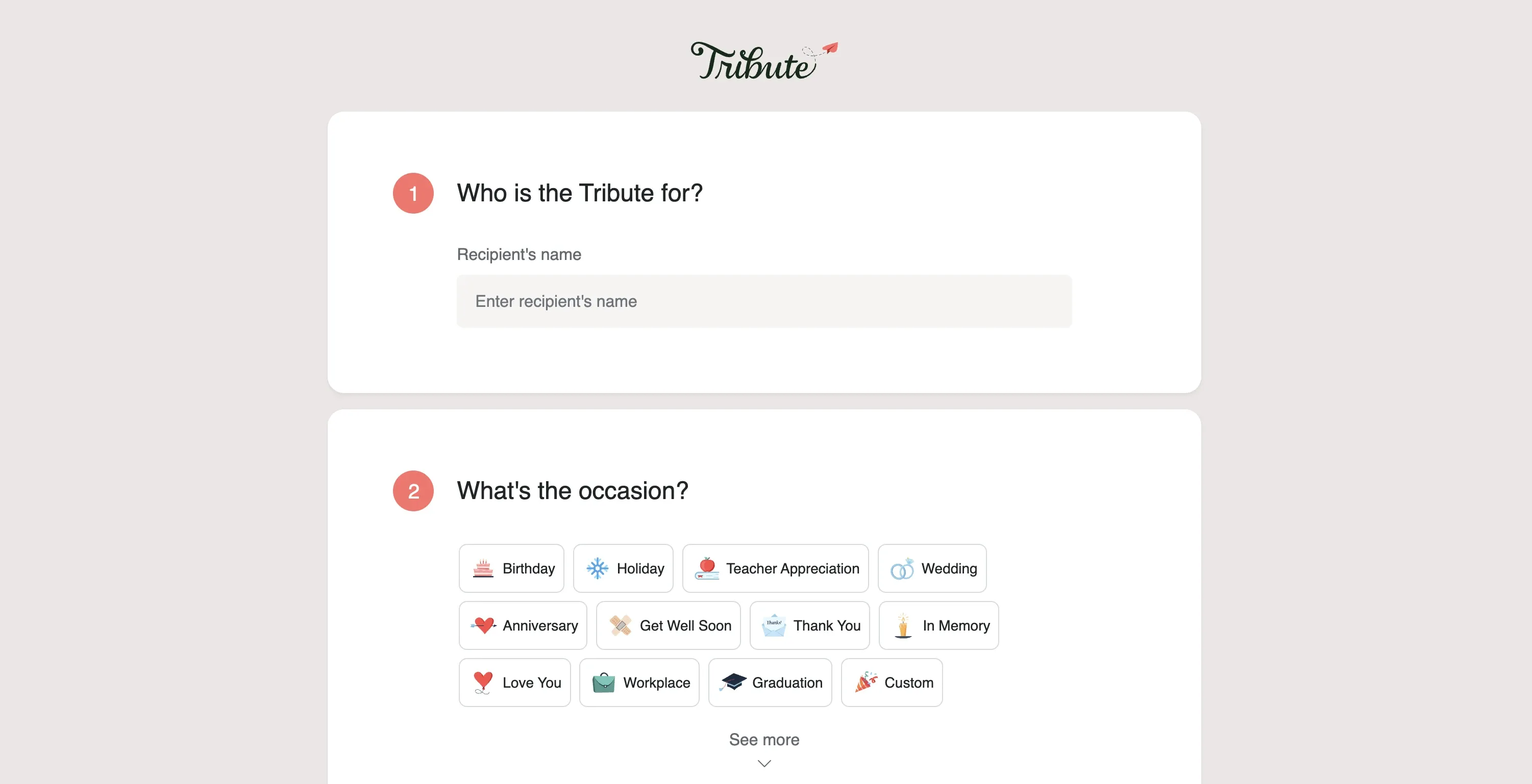
Reimagining onboarding
The existing onboarding flow technically worked, but lacked personality. It was essentially a homemade Typeform. Conversion improved over time—from ~15% to ~25%—but it didn’t reflect the product’s joy.
For V3, onboarding needed to:
- Feel expressive and celebratory
- Tease customization early
- Reduce perceived effort
- Build confidence immediately
Post-launch, onboarding conversion increased to 54%, more than doubling the historical baseline.
Payments, commitment, and clarity
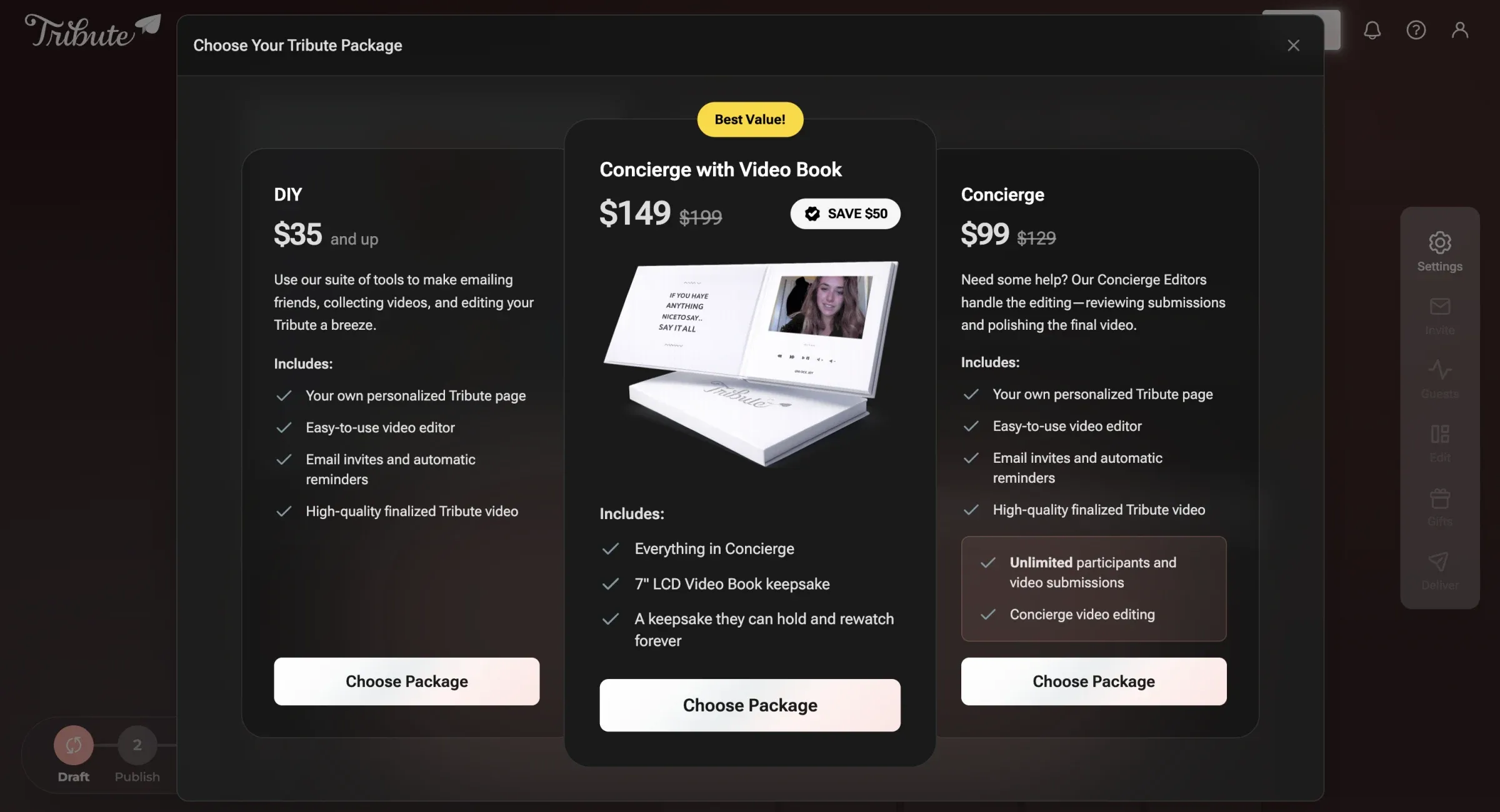
Historically, payment happened at the very end of the experience. While generous, it caused real issues:
- Ad spend was attributed to abandoned tributes
- Late-stage abandonment stayed high
- 16% of checkouts were accidental
Users were signaling readiness to pay earlier, but the flow wasn’t designed to support that intent.
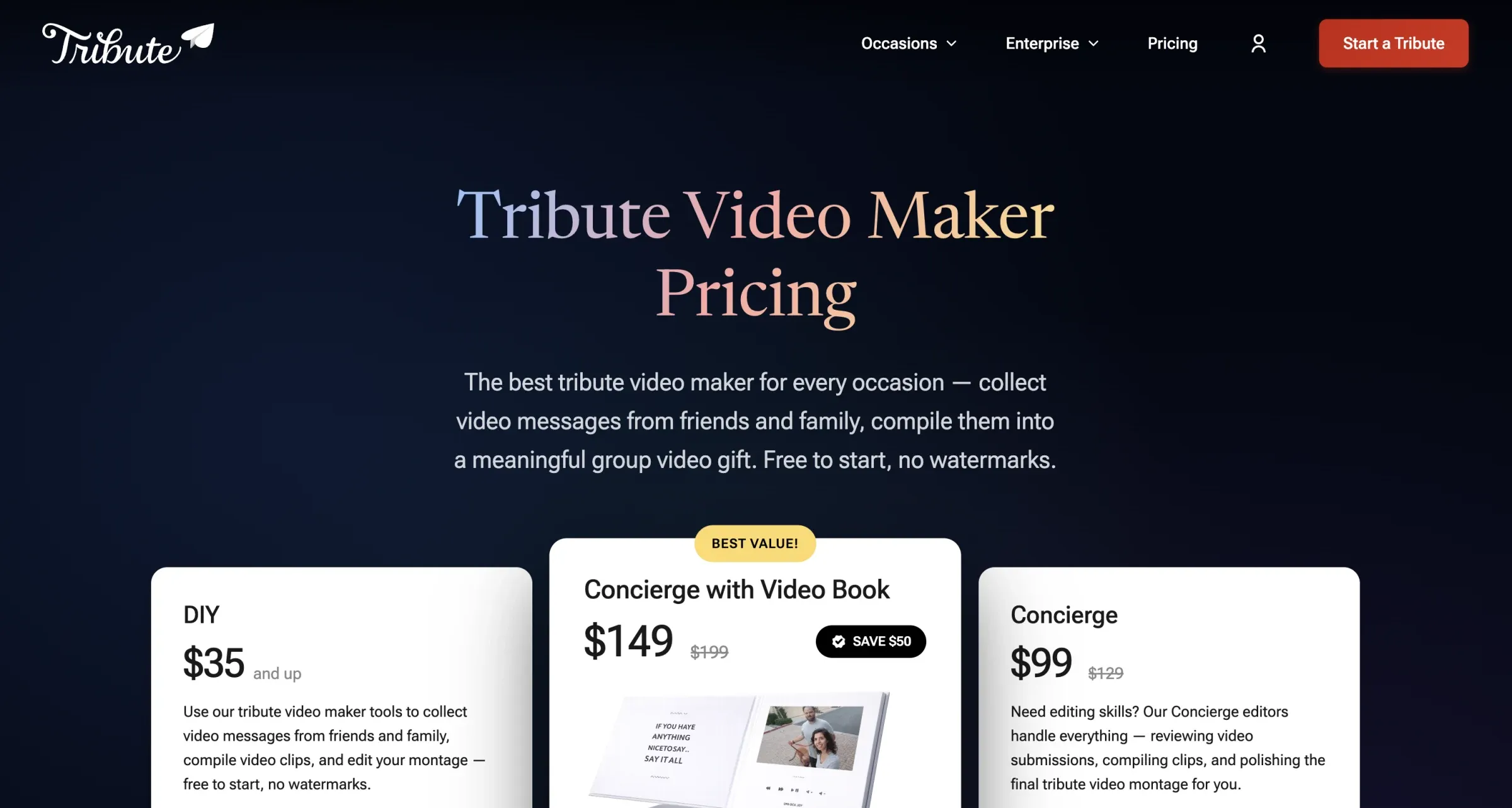
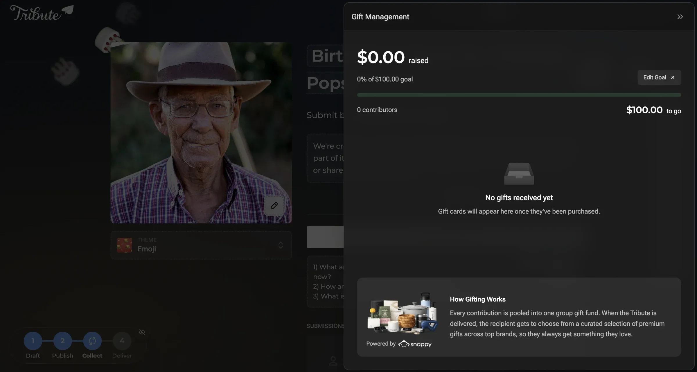
We moved payment to just after the draft stage—keeping the product free to start while aligning payment with commitment and clarity.
Themes and emotional expression
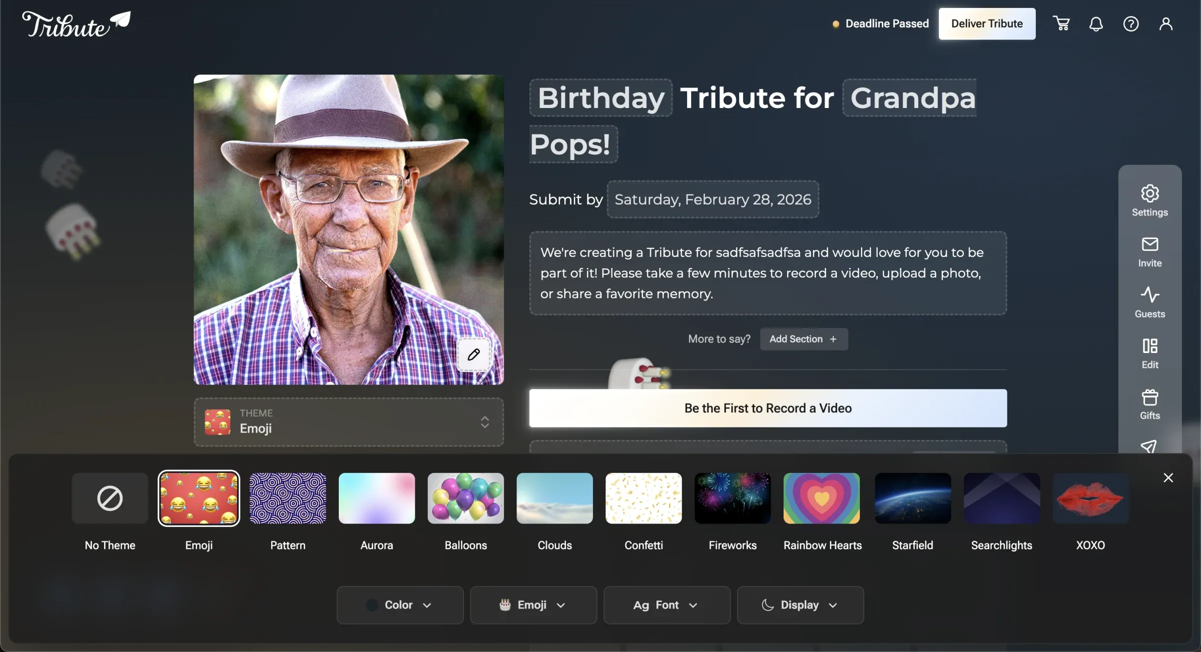
Years of research pointed to a simple truth: users love emojis.
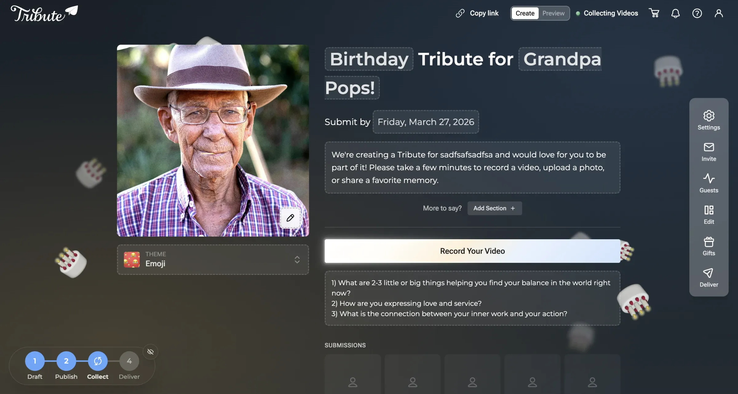
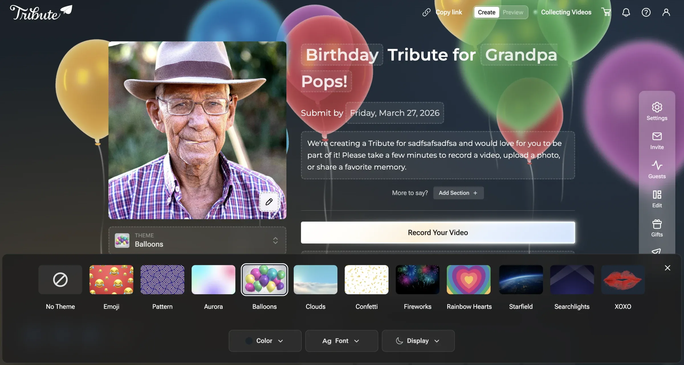
That insight became the foundation of our default theme—animated, occasion-based emoji backgrounds that feel playful and lively. From there, it was easy to add more: graduation caps, balloons, fireworks, seasonal motifs.
We validated theme directions through lightweight discovery and preference testing, using structured prompts and early visuals to gauge emotional resonance before committing to implementation.
Themes were no longer just decoration. They became a key way for users to show intent and emotion.
Design system and technical foundations
At the same time, we needed a system that could support rapid iteration.
Our CTO and I had been experimenting with modern “vibe-coding” tools like Bolt, Lovable, Cursor, and Claude Code. We wanted a design system that worked well with AI-assisted development — one an LLM could read and extend without inventing its own conventions.
I built a lightweight design system using DaisyUI and design tokens:
- Simple theme creation
- Strong token structure
- Built-in theme controller
- Existing LLM documentation and MCP support
We plan to use tools like Tokens Studio and deeper Figma syncing in the future, but DaisyUI offered the right mix of flexibility and speed for now.
Prototyping, iteration, and AI-assisted workflows
Once the foundation was in place, we moved quickly. I bounced between:
- Figma for layout exploration
- Bolt and Lovable for rapid UI scaffolding
- Claude Code and Cursor for deeper engineering work
The AI tools were surprisingly good at producing strong first drafts. Not perfect, but almost always usable — and being able to go from idea to interactive UI quickly changed how fast we could test ideas, and how cheaply we could drop them.
I made an early call to cut Figma out of the critical path. Rather than designing in static files and handing them off, the deliverable was functioning code. I still used Figma for targeted layout exploration, but it was never the source of truth. This approach accelerated the first 60–70% of the work, allowing more time for refinement, validation, and polish.
As complexity grew, weak prompts could introduce regressions—so I continuously tightened constraints and kept the design system grounded in production components rather than static specs.
The team of four was skeptical at first — that’s a fair reaction when you’re changing the most fundamental part of a design workflow. I stayed close to the work, experimented alongside them, and ran one-week sprint cycles combining Lean UX and Agile across product, design, and engineering simultaneously. Within a few sprints, something shifted. When we showed a working prototype of the new checkout flow, stakeholders could actually click through and react to the real experience instead of debating a static mockup—a decision that would have taken two weeks in the old process landed in a single session. The reluctance disappeared because the results were undeniable.
The old way
- 1 Figma as source of truth Static specs only
- 2 Handoff to engineers Specs lose fidelity
- 3 React to mockups Weeks to decide
- 4 Weeks of revision Momentum lost
The new way
- 1 Constrained prompt No vague asks
- 2 Production components only No static specs
- 3 One-week sprint cycles Lean UX + Agile
- 4 Working code delivered Decisions in days, not weeks
One-week sprint cycle
- Sprint Kickoff Define focus area and ownership
- Design & Prototype Build with Lovable, Bolt, V0
- Weekly Share-Out Team review and alignment
- Iteration Refinement from feedback
- Integration CTO + Adam merge to production
- Ship Live product, next sprint
Repeat weekly
User testing and validation
After roughly two months of iteration, we put interactive prototypes in front of users. Using Maze, we ran first-click testing, preference testing, and fake-door experiments for future features.
Users consistently rated the new experience higher for clarity, delight, and ease of use. They completed key flows 30–40% faster and felt much more confident about what would happen next.
Qualitative feedback emphasized:
- Feeling “guided, not rushed”
- Better understanding of customization options
- Stronger emotional connection early in the process
Beyond milestone testing, we relied heavily on unmoderated Maze surveys throughout the process. These lightweight tests helped pressure-test copy, validate feature placement, and gauge emotional response—without slowing momentum.
Supporting tools and research
To support velocity and alignment, we leaned on a few tools beyond Relume:
- Uizard for rapid ideation and concept exploration
- OnBeacon for behavioral insights, helping us validate language, framing, and emotional cues
These let us test ideas early and at low cost, which is what kept us from paying for them later.
Mobile-First by Design
One of the most rewarding aspects of V3 was the mobile experience.
Historically, mobile had been an afterthought. In V3 it became the primary design constraint:
- Type scales tuned specifically for mobile
- Thoughtful spacing and tap targets
- Micro-interactions designed to work seamlessly on touch
The result felt more like a native app than a typical web product — fast, smooth, and deliberate.
We were targeting on gut instinct
Design decisions are only as good as the data behind them. Early in V3, I realized we were making targeting and prioritization calls based on gut instinct and anecdotal support tickets. We had Quantcast running on the site, but the default dashboard wasn’t built for the questions we needed to answer: who exactly is using Tribute, where are they, what do they do for work, and which segments should we optimize for?
So I built a custom audience insights dashboard.
Pulling real data, not just reports
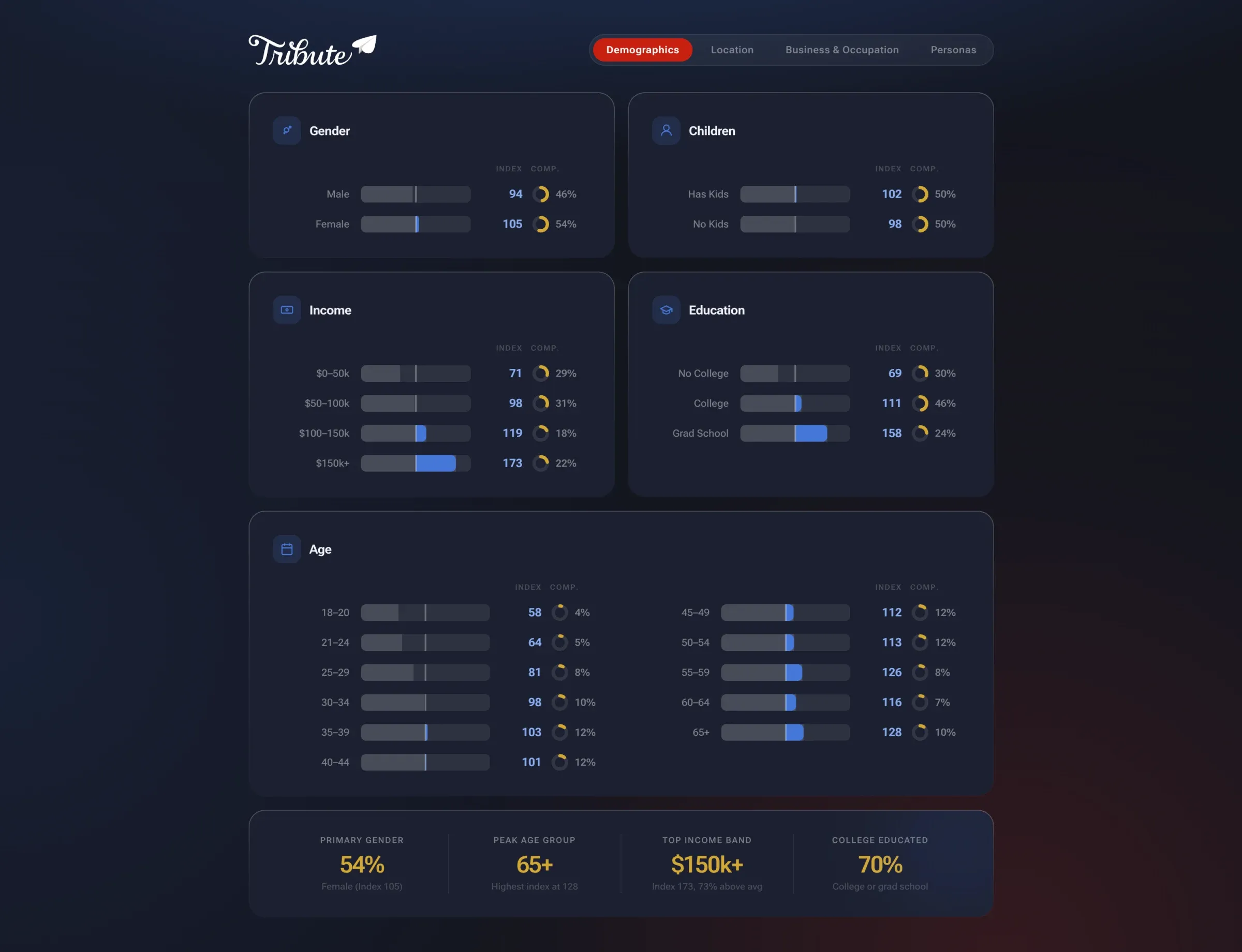
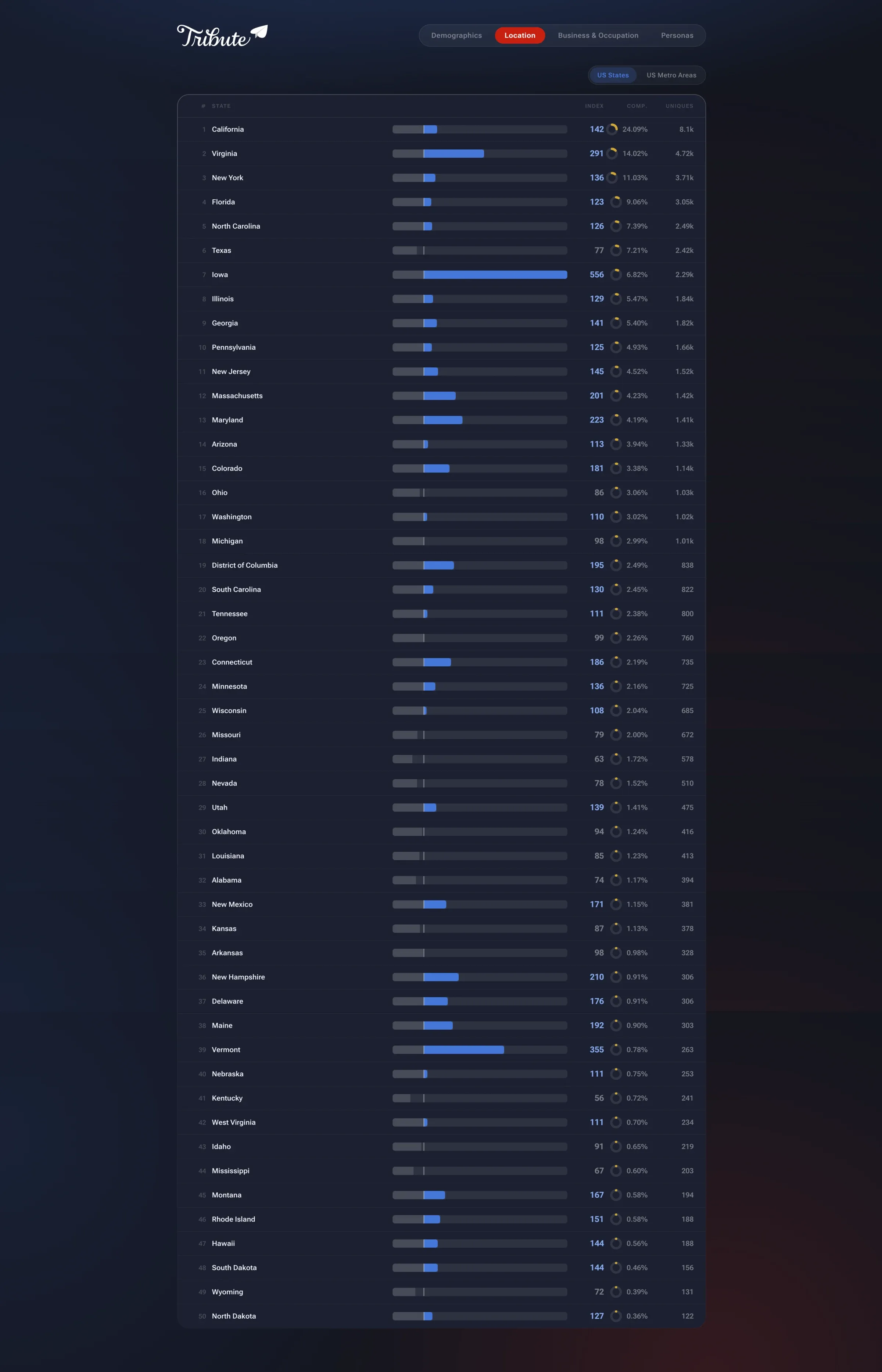
The dashboard connects directly to Quantcast’s GraphQL API, pulling demographic, geographic, and business data dynamically rather than relying on static exports or screenshots. Every view reflects live audience intelligence: gender splits, age distribution, income bands, education levels, and parental status.
A full state-by-state location breakdown with index scores and composition percentages.
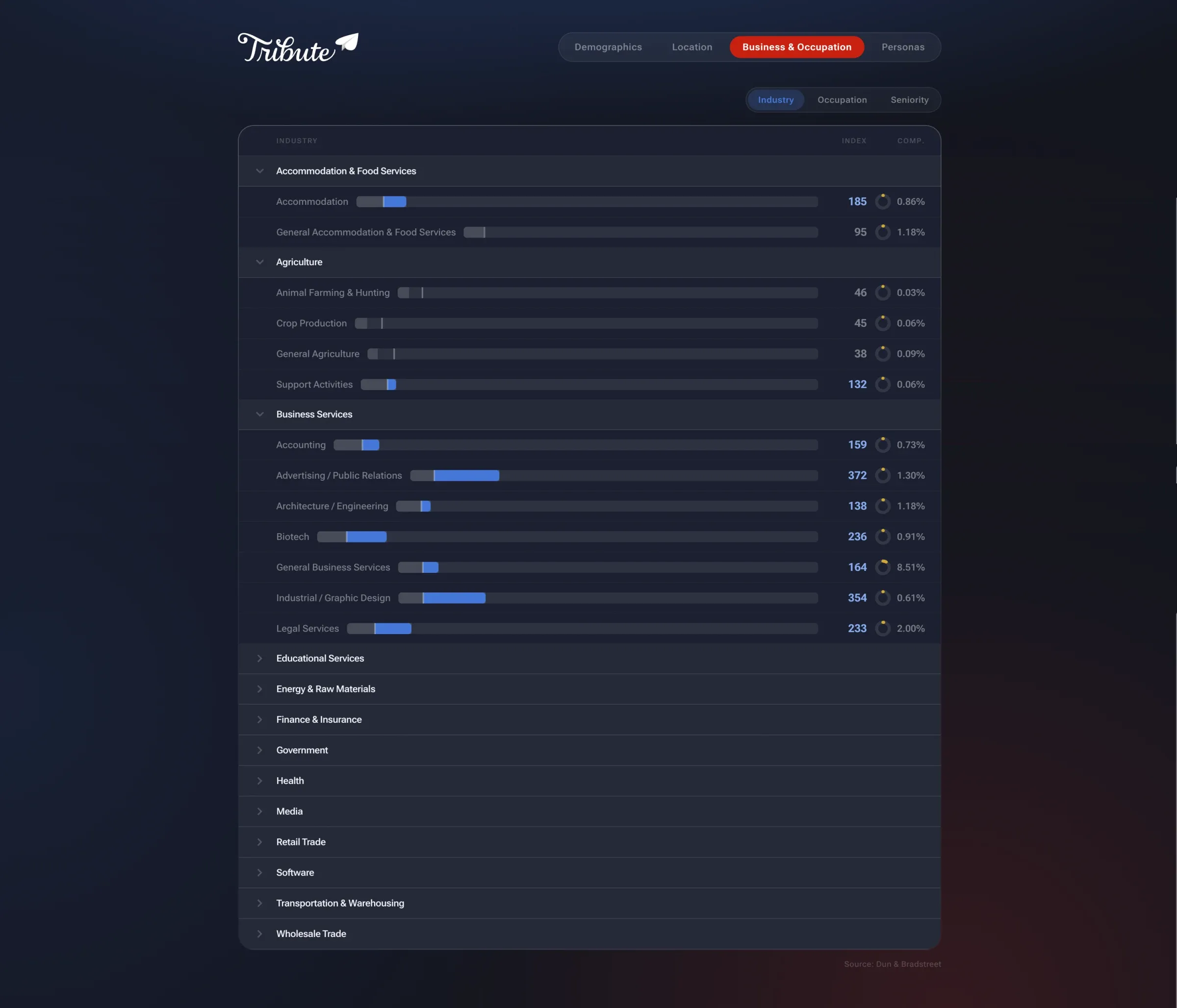
On the business side, the dashboard surfaces industry, occupation, and seniority data sourced through Dun & Bradstreet’s audience intelligence layer. This gave us a clear picture of not just who our users are personally, but what they do professionally and where purchasing power sits.
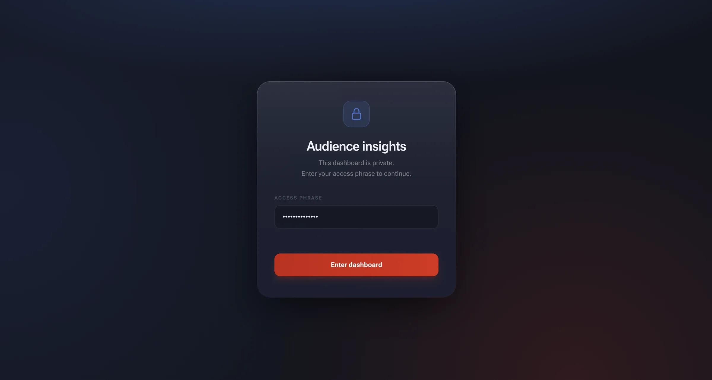
The whole thing is password-protected and built for internal use, designed so the team and stakeholders could explore the data themselves without needing me to pull a report.
From data to archetypes
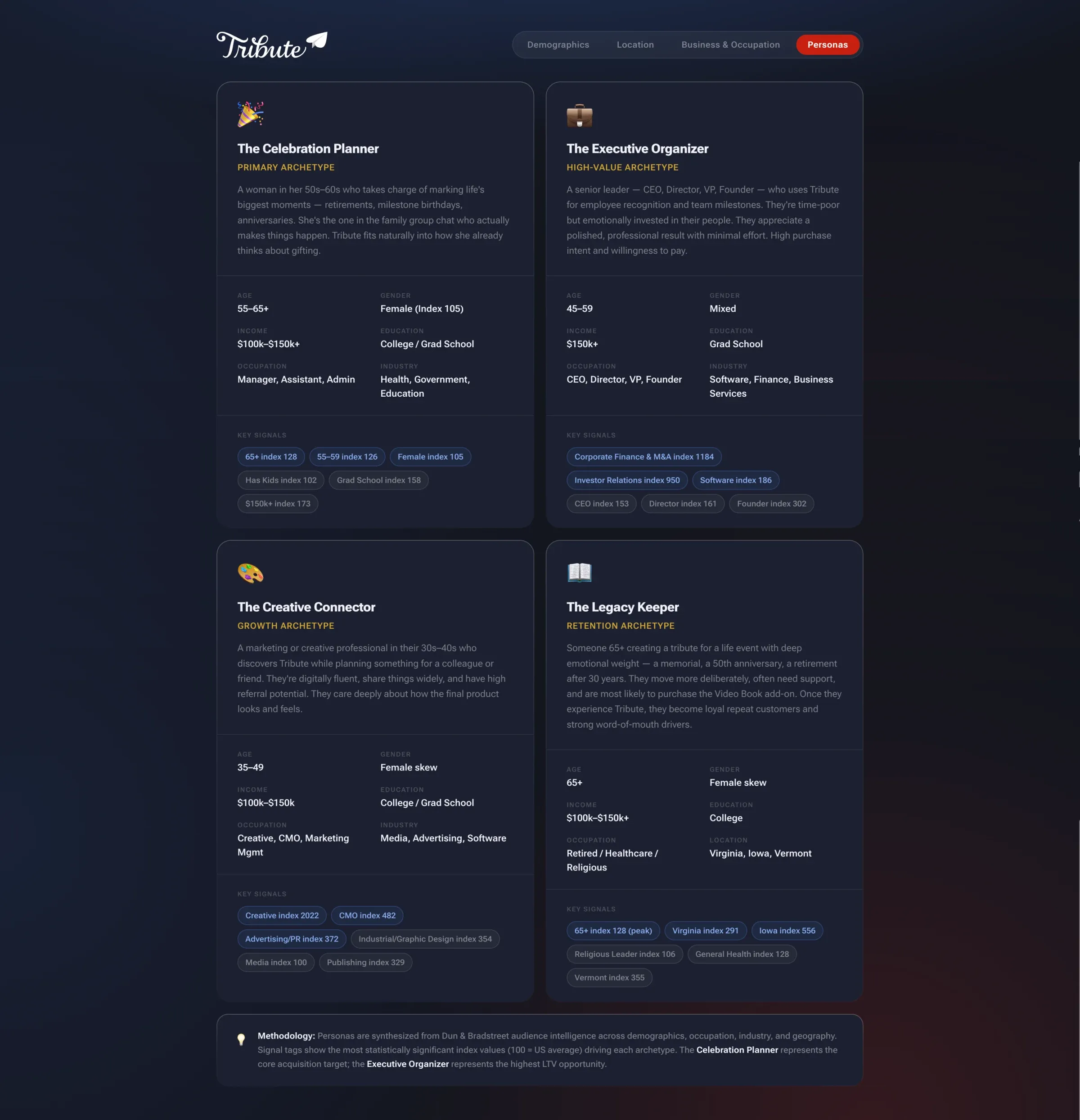
The most actionable output was synthesizing all of this into four audience personas, each grounded in statistically significant index values rather than assumptions.
-
The Celebration Planner
Primary archetype
A woman in her 50s–60s who takes charge of marking life's biggest moments — retirements, milestone birthdays, anniversaries. She's the one in the family group chat who actually makes things happen. Tribute fits naturally into how she already thinks about gifting.
- Age
- 55–65+
- Gender
- Female (index 105)
- Income
- $100k–$150k+
- Education
- College / Grad School
- Occupation
- Manager, Assistant, Admin
- Industry
- Health, Government, Education
Key signals
- 65+ index 128
- 55–59 index 126
- Female index 105
- Has Kids index 102
- Grad School index 158
- $150k+ index 173
-
The Executive Organizer
High-value archetype
A senior leader — CEO, Director, VP, Founder — who uses Tribute for employee recognition and team milestones. They're time-poor but emotionally invested in their people. They appreciate a polished, professional result with minimal effort. High purchase intent and willingness to pay.
- Age
- 45–59
- Gender
- Mixed
- Income
- $150k+
- Education
- Grad School
- Occupation
- CEO, Director, VP, Founder
- Industry
- Software, Finance, Business Services
Key signals
- Corporate Finance & M&A index 1184
- Investor Relations index 950
- Software index 186
- CEO index 153
- Director index 161
- Founder index 302
-
The Creative Connector
Growth archetype
A marketing or creative professional in their 30s–40s who discovers Tribute while planning something for a colleague or friend. They're digitally fluent, share things widely, and have high referral potential. They care deeply about how the final product looks and feels.
- Age
- 35–49
- Gender
- Female skew
- Income
- $100k–$150k
- Education
- College / Grad School
- Occupation
- Creative, CMO, Marketing Mgmt
- Industry
- Media, Advertising, Software
Key signals
- Creative index 2022
- CMO index 482
- Advertising/PR index 372
- Industrial/Graphic Design index 354
- Media index 100
- Publishing index 329
-
The Legacy Keeper
Retention archetype
Someone 65+ creating a tribute for a life event with deep emotional weight — a memorial, a 50th anniversary, a retirement after 30 years. They move more deliberately, often need support, and are most likely to purchase the Video Book add-on. Once they experience Tribute, they become loyal repeat customers and strong word-of-mouth drivers.
- Age
- 65+
- Gender
- Female skew
- Income
- $100k–$150k+
- Education
- College
- Occupation
- Retired / Healthcare / Religious
- Location
- Virginia, Iowa, Vermont
Key signals
- 65+ index 128 (peak)
- Virginia index 291
- Iowa index 556
- Religious Leader index 106
- General Health index 128
- Vermont index 355
Methodology: Personas are synthesized from Dun & Bradstreet audience intelligence across demographics, occupation, industry, and geography. Signal tags show the most statistically significant index values (100 = US average) driving each archetype. The Celebration Planner represents the core acquisition target; the Executive Organizer represents the highest LTV opportunity.
The Celebration Planner is our primary archetype and core acquisition target: women 55-65+, college-educated, household income $100k-$150k+, working in health, government, or education. She’s the one organizing retirements and milestone birthdays in the family group chat. Tribute fits naturally into how she already thinks about gifting.
The Executive Organizer represents our highest-LTV segment: senior leaders (CEOs, directors, VPs, founders) aged 45-59 in software, finance, and business services. They’re time-poor but emotionally invested in recognizing their teams. They want a polished result with minimal effort and have high willingness to pay.
The Creative Connector is a growth archetype: marketing and creative professionals in their 30s-40s who discover Tribute through workplace use and have high referral potential. They care deeply about how the final product looks and feels.
The Legacy Keeper is a retention archetype: someone 65+ creating a tribute for a memorial, a 50th anniversary, or a retirement after 30 years. They move more deliberately, often need support, and are the most likely to purchase the Video Book add-on. Once they experience Tribute, they become loyal repeat customers and strong word-of-mouth drivers.
These personas directly informed ad targeting, copy decisions, onboarding tone, and which features we surfaced early versus kept secondary. When we wrote headlines for the creation modal or chose default theme options, we weren’t guessing. We knew who was on the other end.
Results and Impact
The redesigned platform launched with meaningful improvements across the board:
- Starts: +29%
- Start → publish conversion: +24%
- Purchases: +19%
- Participant engagement: +10%
- CSAT: +20%
Beyond the numbers, V3 gave the team a modern, scalable foundation. Iteration became safer, experimentation cheaper, and future improvements easier to ship — and the platform finally matches what users experience Tribute to be.
Reflection
Tribute V3 was not about following trends or using the latest tools. It was about honoring what the product had already become: emotionally meaningful and deeply personal, used by millions for retirements, memorials, birthdays, and milestones — with the expectation that the experience would match the weight of those moments. We wanted to build a platform that finally matched that reality.
It also fundamentally changed how we build. We rethought what a design system actually is — not a Figma library, but a living system rooted in AI-assisted prototyping where the deliverable is functioning code. Design and engineering now operate around shared production components, experimentation carries less risk, and one-week sprint cycles became the new normal. Ideas move from concept to reality faster without sacrificing quality.
V3 sits at the intersection of design, engineering, and emerging workflows, and it set a new baseline for how we work at Tribute going forward. If I were to revisit it, I’d invest earlier in documenting the prompt patterns that worked—we learned them on the fly, and that knowledge lived mostly in my head.
- +29%
- Starts
- +24%
- Start → Publish
- +19%
- Purchases
- +20%
- CSAT
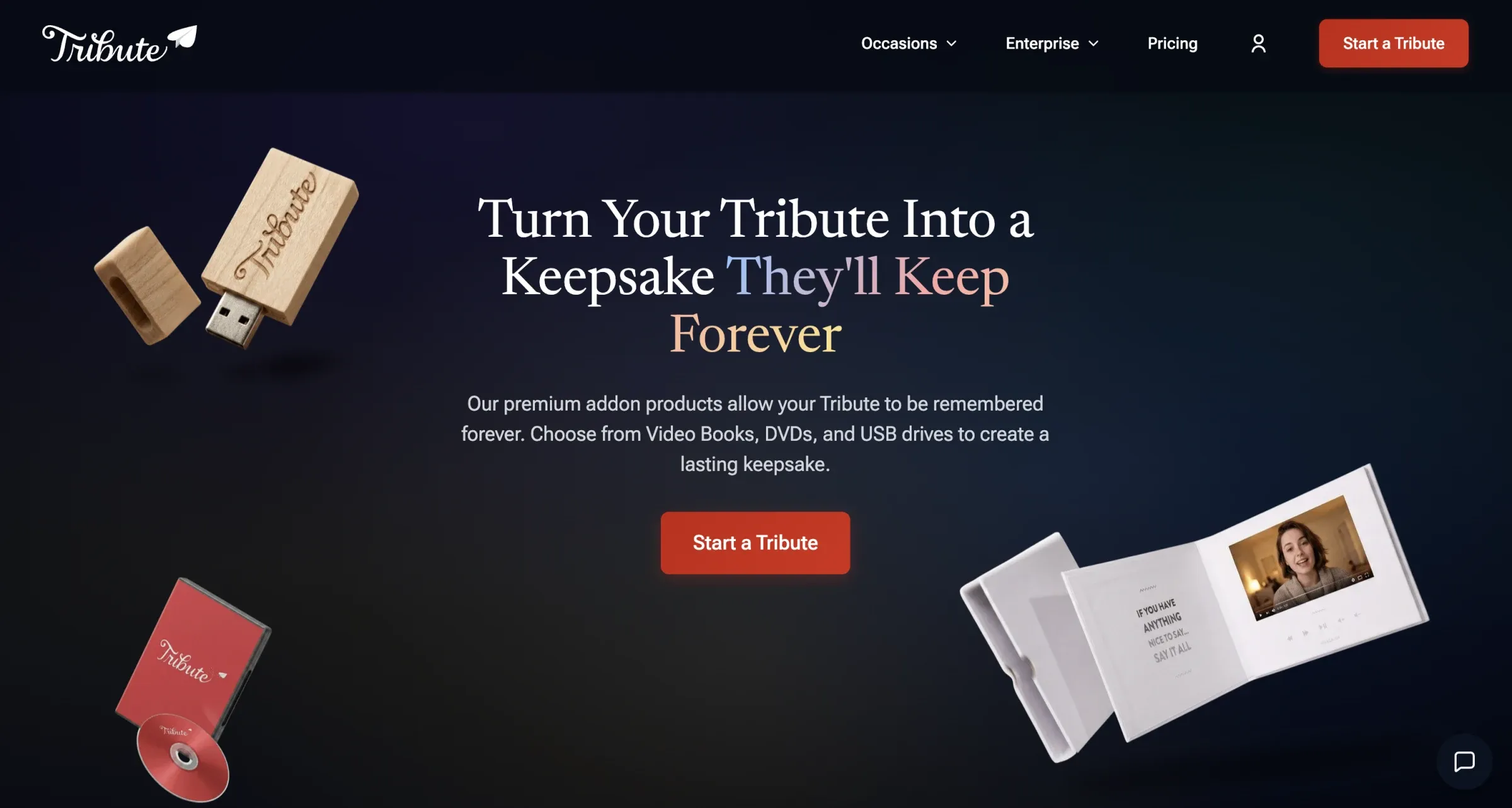
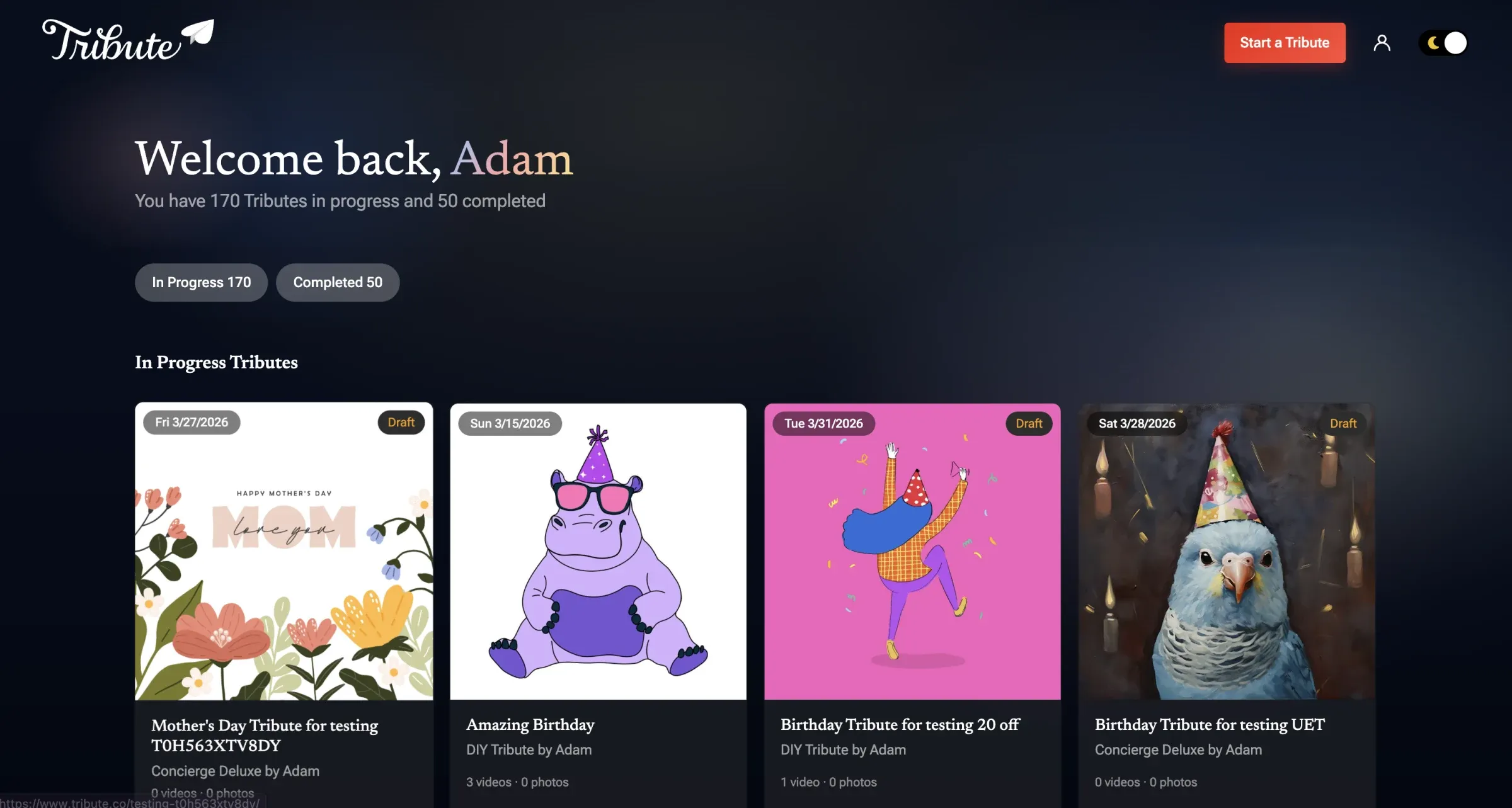
To view the live site and experience the improved platform, visit tribute.co

Next project