Tribute Greetings · 2022
Launching a new product on three platforms
A 0→1 product built from scratch in eight months — validated with 300 research participants, then deliberately made smaller.
- Role
- Director of Product Design
- Scope
- New product launch (web, iOS, Android), end-to-end design and development
- Team
- 2 designers, frontend, backend engineering
- Timeline
- ~6–8 months (web + iOS launch)
Impact
Shipped on web, iOS and Android
One Ionic/Vue codebase across all three, reusing auth and marketplace code from the existing Tribute site.
300 research participants
Moderated and unmoderated sessions, card sorting and tree testing, synthesised in Dovetail.
We cut features rather than adding them
Validation testing killed the audio and social integrations we had assumed would be the draw. Simplicity won.
Overview
Tribute recognized the growing digital gift and greeting market and decided to disrupt it, launching Tribute Greetings in 2022. Two trends made the case: an e-commerce gifting market projected to reach $1 trillion, and rapid growth in e-cards. Tribute Greetings set out to bridge the gap in that marketplace with a platform built on curated gifts and personalized video greetings.
Problem & Opportunity
The digital gifting and e-card markets have grown fast, changing how people express celebration and appreciation online. But the growth exposed a void: digital gifting can’t replicate the meaningfulness and personal expression of the traditional kind, which limits how deep a connection it can build with customers.
That void is what Tribute Greetings was created to fill — to make digital gifting a deeply personal experience rather than a transactional one.
Video, a gift, and help knowing what to say
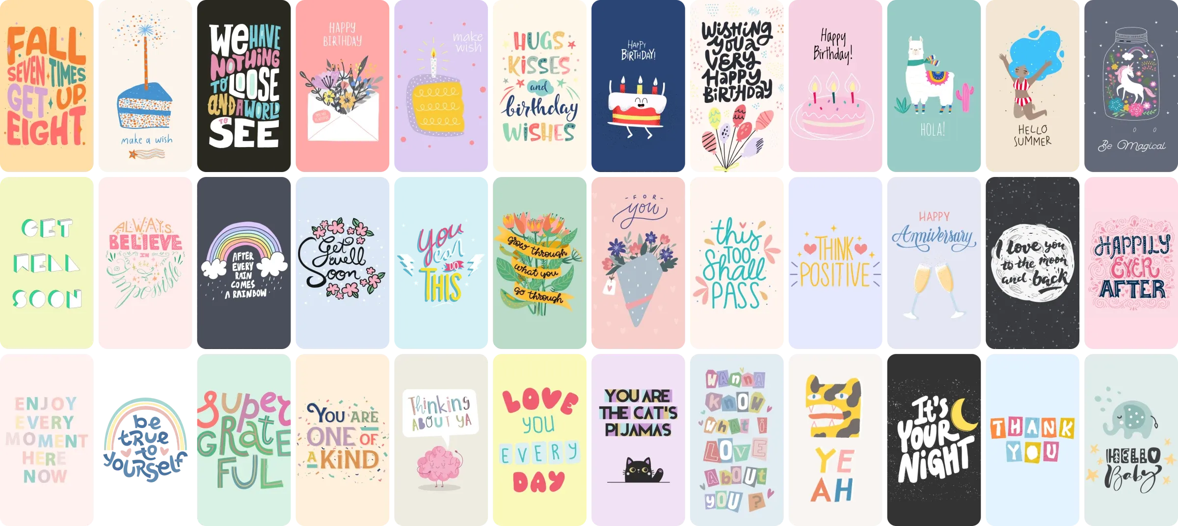
Tribute Greetings focuses on meaningful curation and emotional connection. Three features carry it:
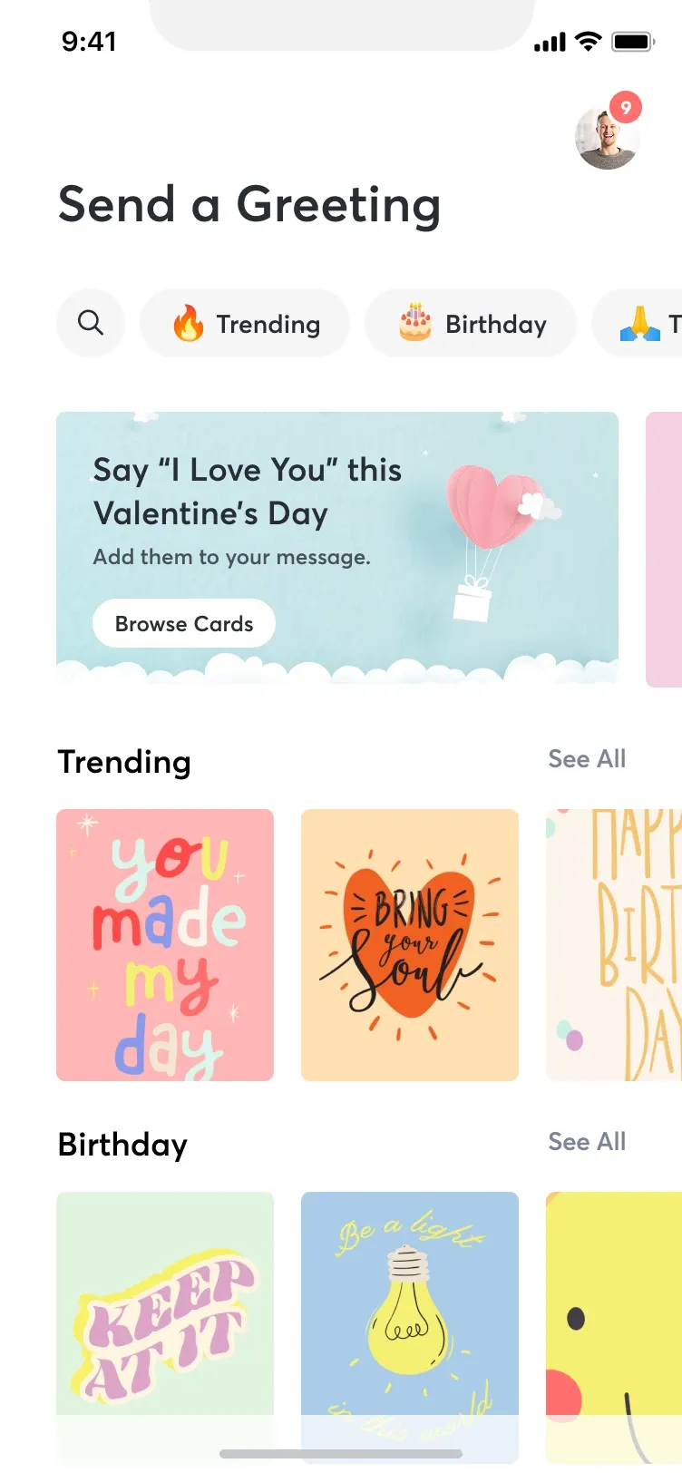
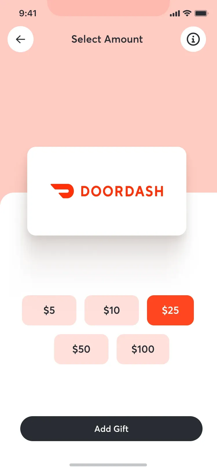
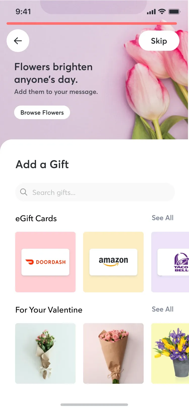
- Curated gifts: Gift cards, flowers and artisanal products — a more creative option than a standard e-gift card.
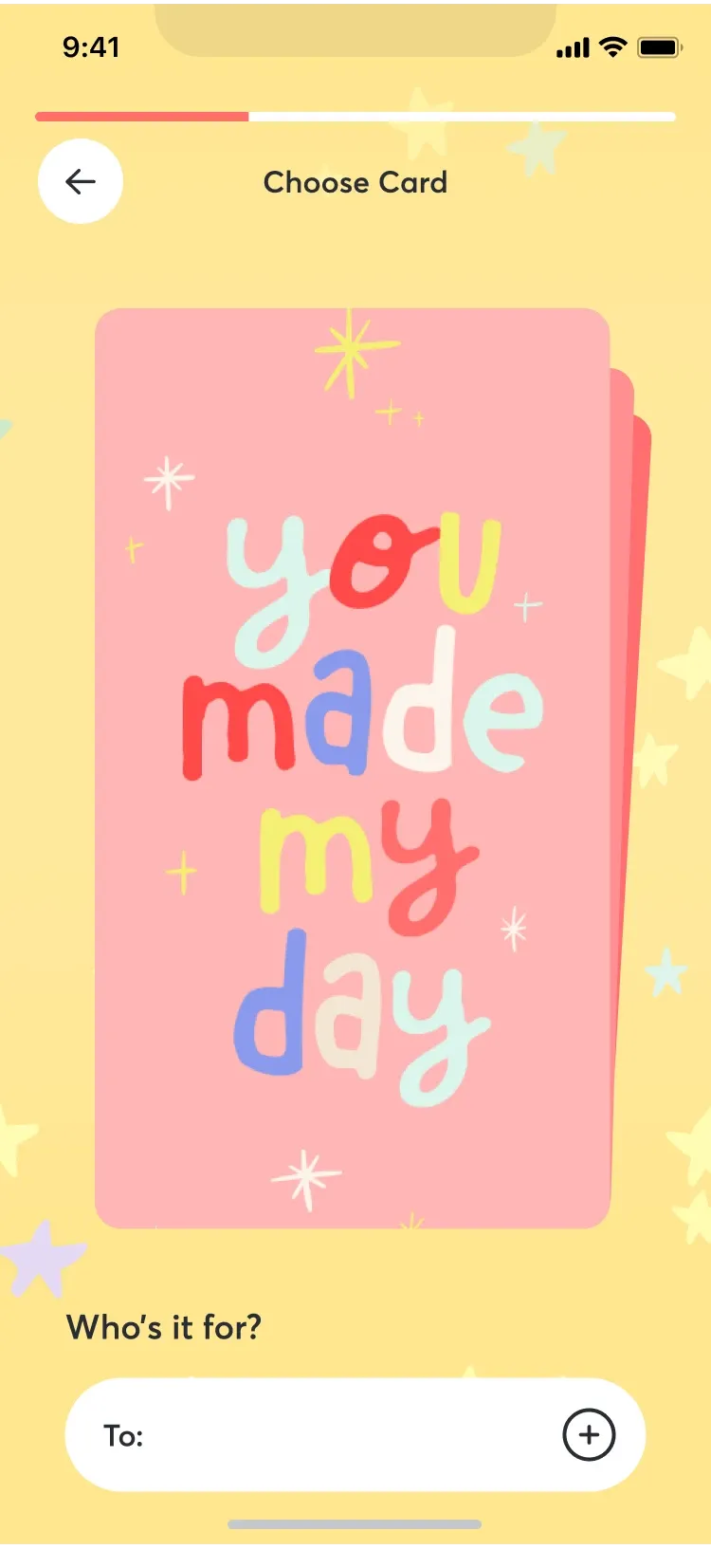
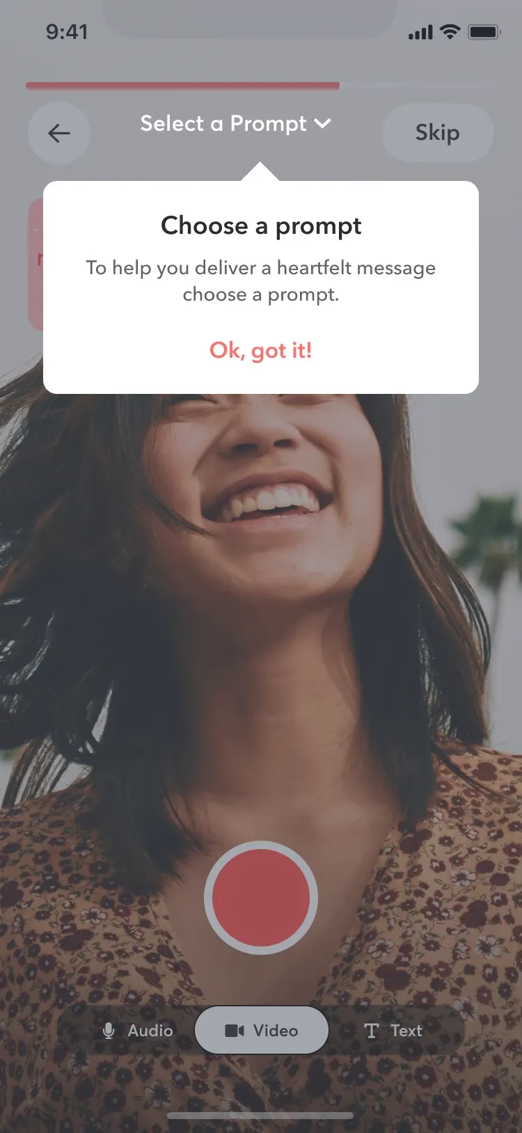
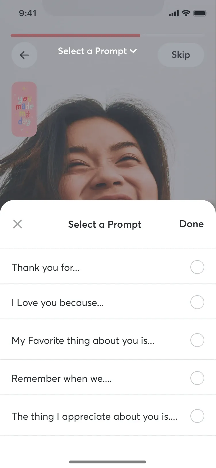
- Prompt cards: Prompt statements that help users write heartfelt messages and personalize video greetings.
- Group gifting: Multiple people contributing to a single greeting, which raises its significance.
Features and Differentiation
While Tribute Greetings utilizes the established brand reputation of Tribute for creating meaningful experiences, it adds many new features that provide differentiation:
- Brand and message: Tribute emphasizes gratitude and meaningful connections throughout the entire application.
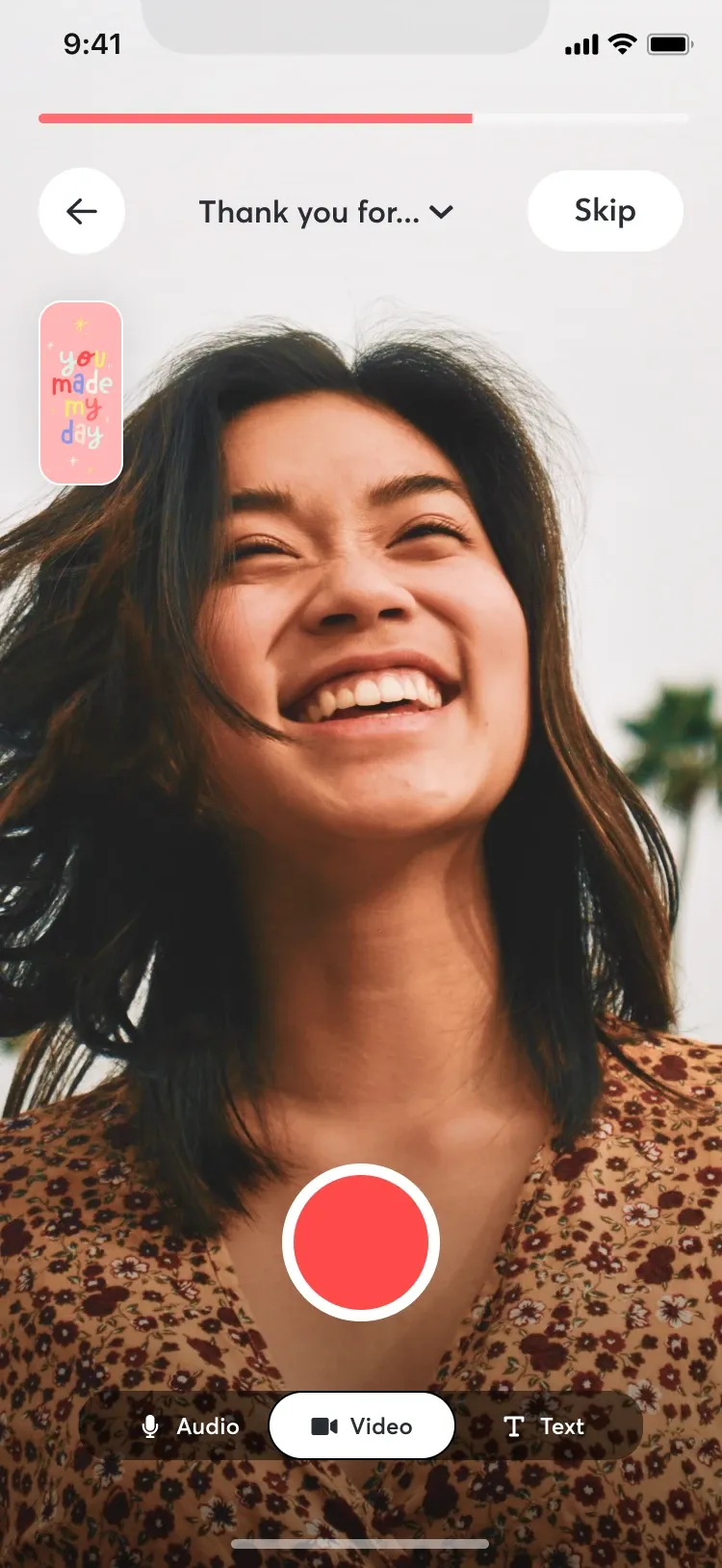
- Prompt statements: These assist users in crafting personalized messages, addressing one of the most significant issues associated with digital gifting — conveying genuine emotions.
- Reminders feature: Allows users to never miss an opportunity to make someone feel special.
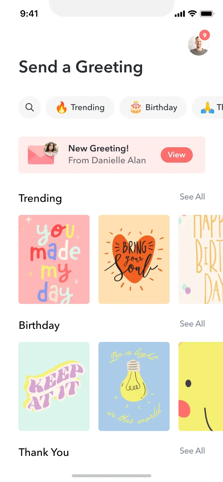
- Story player experience: A familiar, engaging way to view greetings, borrowed from the story players people already use on social platforms.
Target Audience
Tribute Greetings was built for a variety of users who seek to establish connections and celebrate milestones in meaningful ways. The primary personas were:
- Grateful Gill: Active on social media and values mindfulness; looking for ways to acknowledge and celebrate others’ successes.
- Leader Lee: Wants to promote the values of his corporation through meaningful expressions of appreciation.
- Gifter Gray: Looking for gifts that will represent a deep connection and appreciation.
Business Model
Tribute Greetings was designed to generate revenue through a multi-pronged business model:
- eGift card affiliates: Leverage the popularity of e-gift cards while taking advantage of lower-than-average breakage rates and increased affiliate margins.
- Pro subscription: Offer advanced features at a premium price, including no processing fees, exclusive card designs, and enhanced support.
- Diverse gift marketplace: Expand beyond e-gift cards to include a broader selection of curated gifts, resulting in higher affiliate margins.
User Research
To ensure the new application would meet the needs of the intended audience, the Tribute Greetings team conducted a thorough, detailed user research project. The study involved 300 participants from a diverse demographic range, including different age groups, genders, and geographic locations. Utilizing both qualitative and quantitative methodologies, the research aimed to generate actionable insights that would inform the application’s design and feature set and create a valuable, enjoyable user experience.
Methodology
Using moderated and unmoderated UX research tools such as Lookback and PlaybookUX, the team conducted a combination of moderated and unmoderated sessions. Moderated sessions ranged from 30 to 60 minutes and allowed for a deep dive into users’ experiences with the Tribute website and their expectations for a new digital gifting product. The focus of the research was on understanding the emotional and functional aspects of digital gifting, gathering feedback on potential features, and determining whether a one-to-one digital gifting solution would be appealing to users.
Unmoderated sessions provided additional insight into how users interacted with various features in the prototype, as well as their preferences for user flow and usability. In addition, users participated in card sorting and tree testing activities, which helped refine the app’s information architecture and create an easy-to-navigate, seamless user experience.
Analysis and synthesis tools
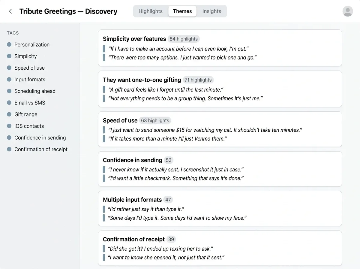
The abundance of data generated during these research sessions was carefully organized and analyzed using Dovetail, a tool chosen for its strong capabilities in managing and analyzing UX research data. Before diving into Dovetail’s features, here’s a quick summary of the top three user needs identified:
- Desire for personalization: Users expressed a need for more personalized, one-to-one gifting experiences.
- Importance of simplicity: Users preferred straightforward and uncluttered interfaces to enhance their digital experience.
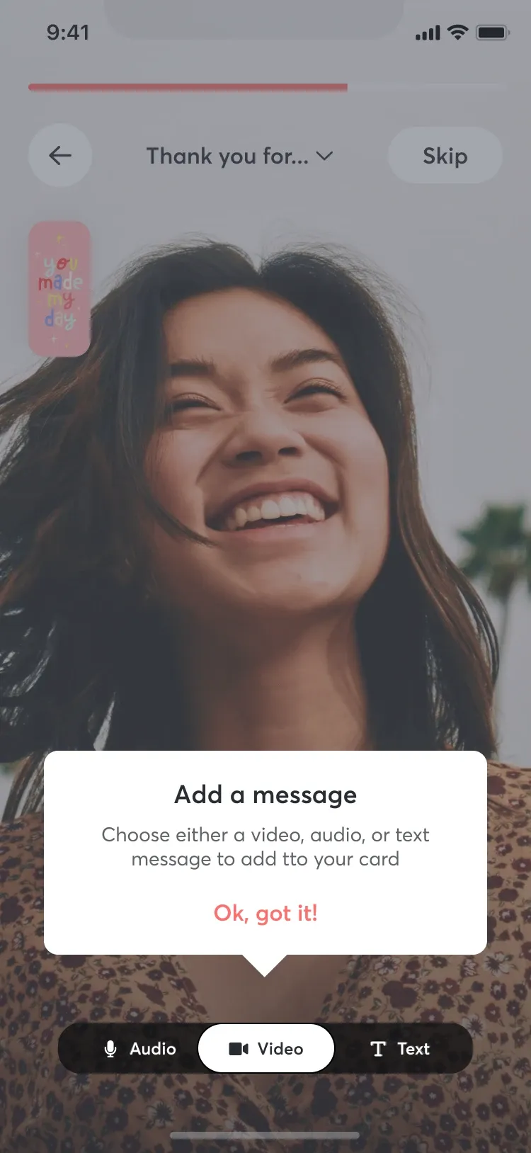
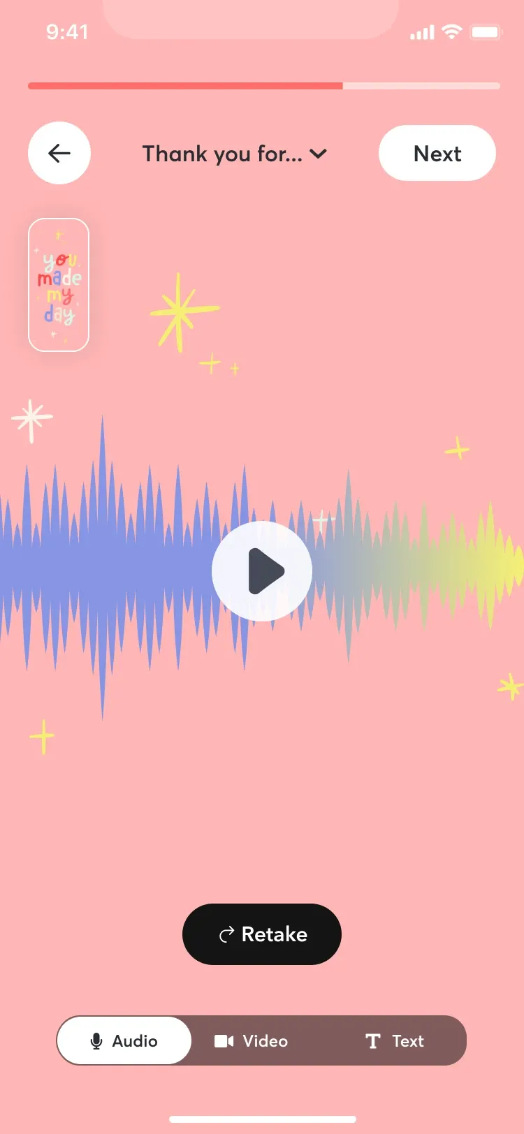
- Preference for diverse input options: Users showed interest in varied methods of content entry, including text, video, and audio.
Using Dovetail, the team was able to identify common themes, user needs, and user preferences, allowing for a data-driven approach to developing the product. Dovetail’s collaborative features enabled the team to share insights and data, promoting informed decision-making and prioritizing design elements and features.
Findings
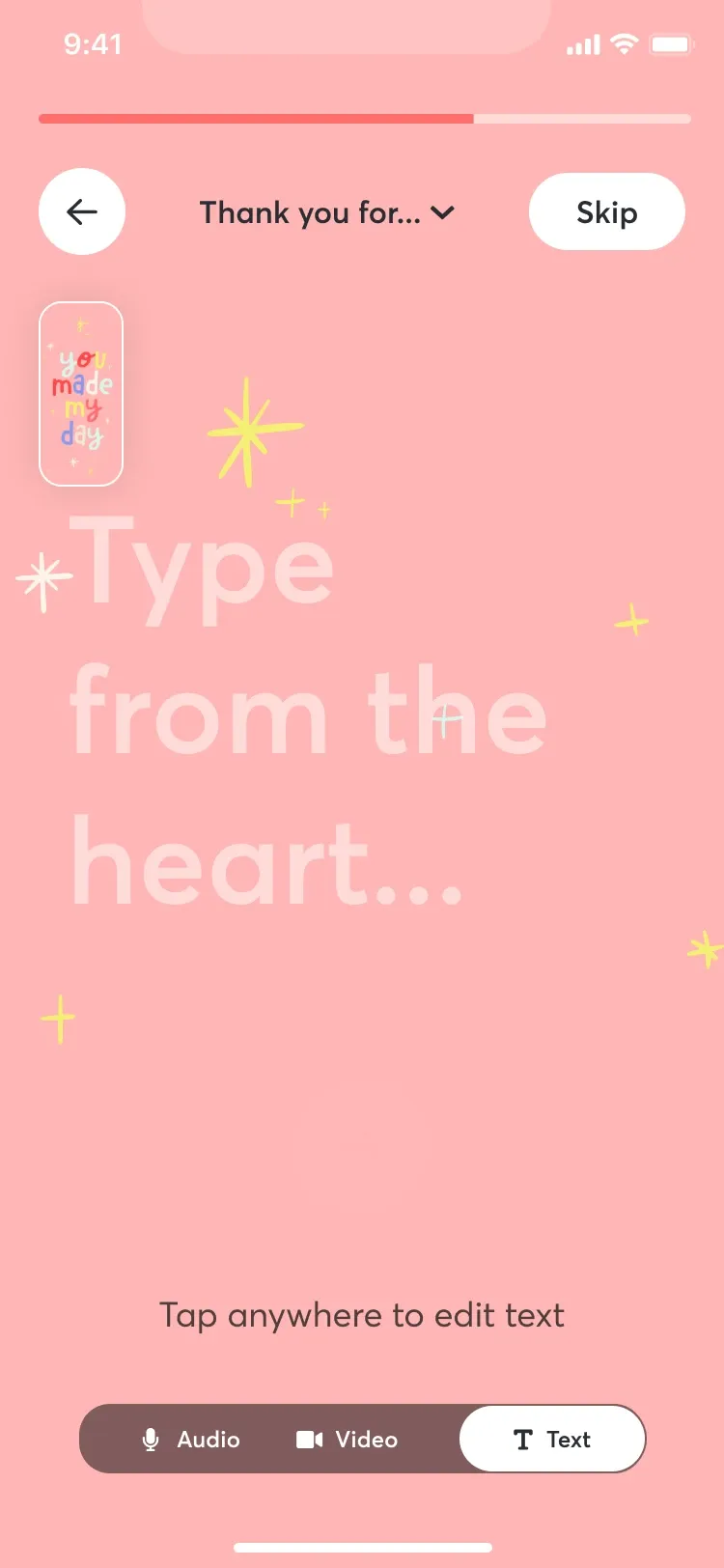
Insights from the user research phase supported the team’s assumption that a significant number of users were seeking a more personal, one-to-one gifting experience, validating the team’s hypothesis about the market’s needs. To address this, the design included features such as personalized video greetings and curated gift options that align with user preferences for individualized interactions. Insights revealed that users preferred entering content in diverse formats, including text, video, and audio, which led to the introduction of multiple input options within the app.
Impact
Research did two jobs here. It confirmed the market needed a one-to-one gifting product, and it set the direction for what we built. Every feature that shipped traces back to something in this phase.
Jammin’ in FigJam
Having identified the necessary insights from our user research, we moved to detail our early prototypes in FigJam. This stage of the project was critical for mapping out the app’s user flow and interface and ensuring that our users could easily accomplish their goals. As the Director of Product Design, I not only worked on the application’s design but also directed my two designers through the design process. Our objective was to create simple, user-friendly interfaces that would allow users to experience the concept of one-to-one digital gifting.
Designing the MVP
Having developed the foundational design concepts in FigJam, we began designing the MVP version of Tribute Greetings. Due to time constraints, we utilized weekly design sprints to rapidly test and refine our ideas. Important to our sprint methodology were the use of “Crazy Eights” and “Solution Sketches.” Both of these tools drove creativity and quickly produced a multitude of possible solutions. We utilized these tools to focus our efforts and to create a user-centered experience.
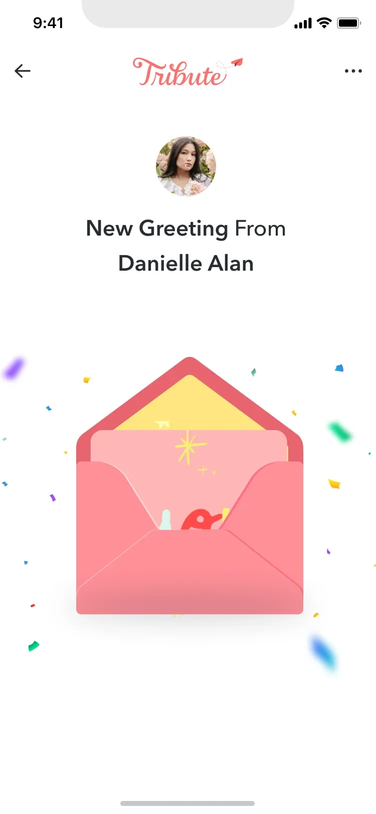
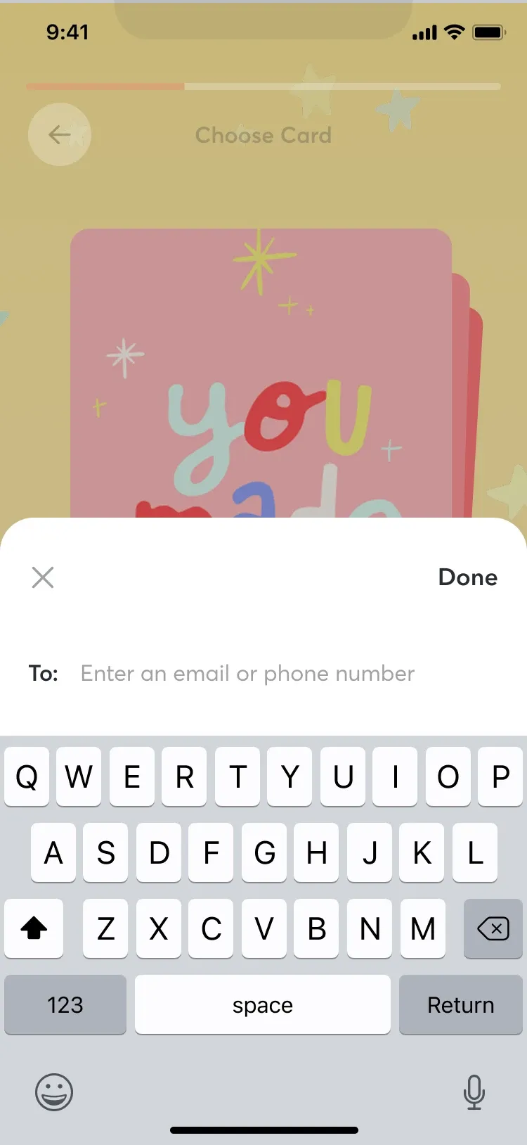
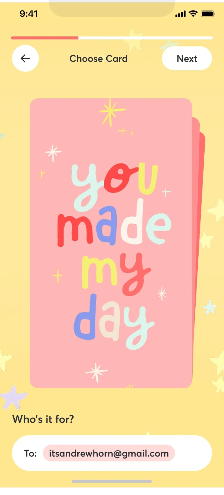
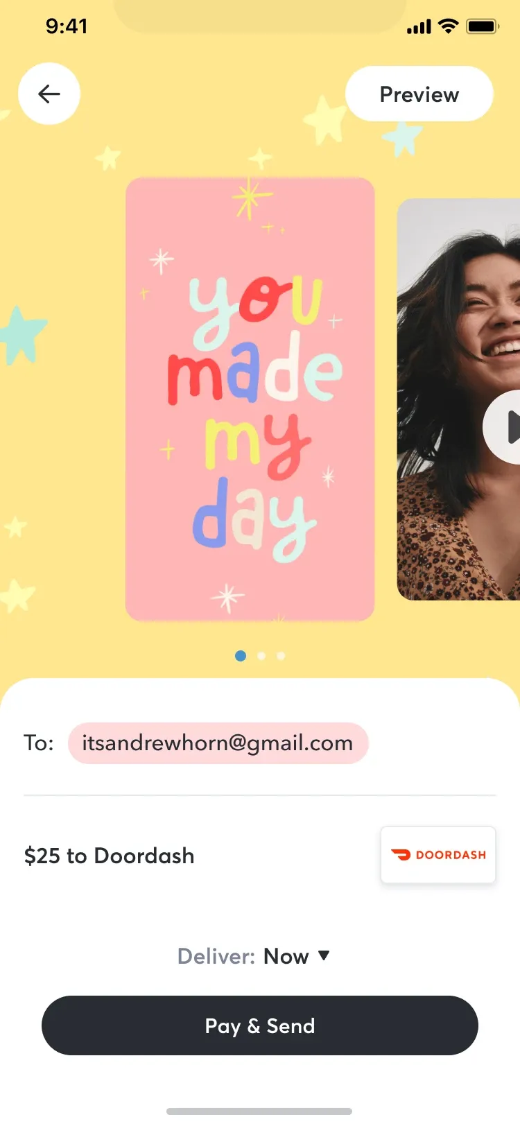
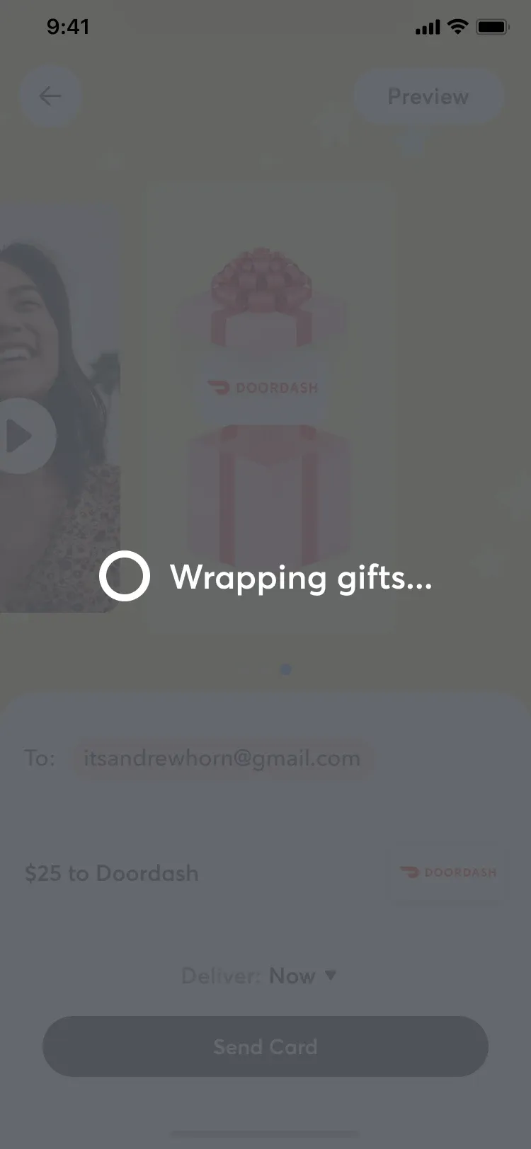
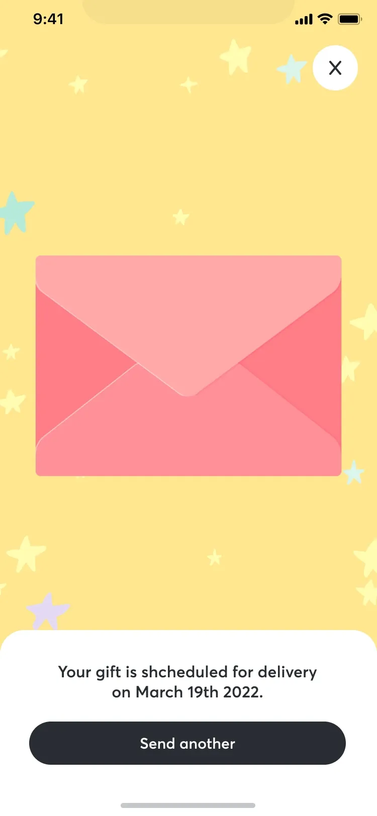
The app was built using two primary user flows: gift giving and gift receiving. Each of these flows contained several secondary flows that comprised the overall user experience. By creating a single path for each type of user interaction, we were able to optimize each individual step of the user journey and provide a cohesive and enjoyable experience for both senders and receivers of greetings.
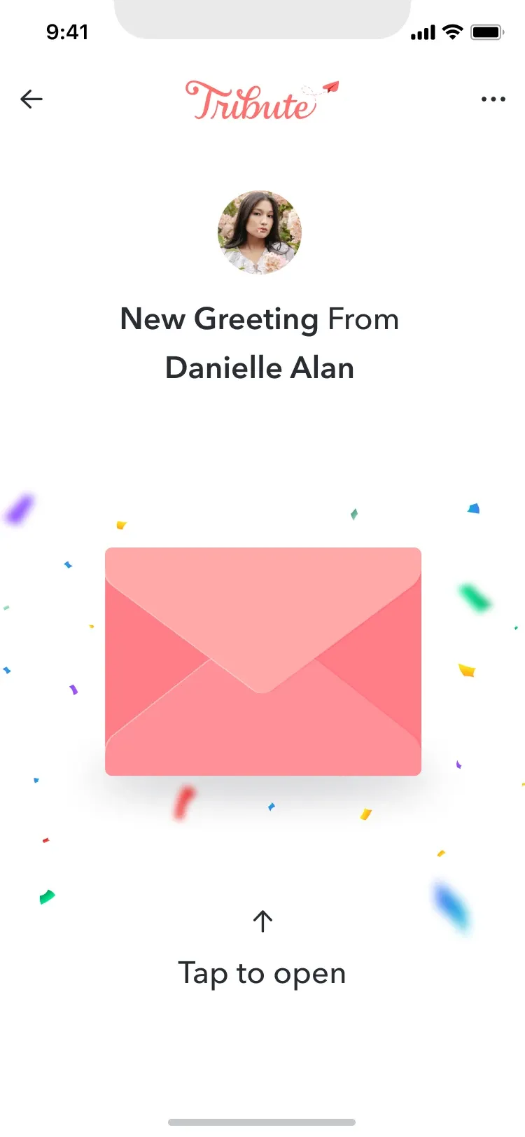
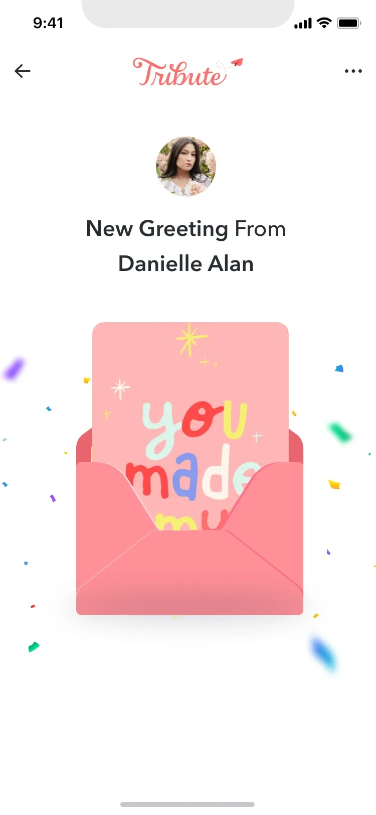
Receiving got the most attention per screen it earned. It is the moment the whole product exists for, and it is also the only part a recipient ever sees — so it had to carry the brand on its own, with no onboarding and no context.
Where we were wrong
With the high-fidelity design done, we needed to validate the UI with real users. We went back to Maze for unmoderated, task-based testing — fast, actionable feedback from simulated real-world use.
We contacted our existing base of 2 million Tribute creators via email and invited them to participate in these tests. This was an effective strategy because it allowed us to gather feedback from users who already knew the Tribute brand and were unfamiliar with the Greetings application.
Maze uncovered several important details about our design decisions. We initially assumed that the inclusion of audio features and social connectivity options would be a major draw for users. However, the results indicated that users placed a greater value on simplicity and clarity when sending greetings. Users expressed frustration with the overwhelming number of social networks and preferred a more direct and uncomplicated experience for expressing their feelings. This unexpected finding led us to reevaluate our roadmap, simplifying the design to prioritize ease of use. By focusing on what truly resonated with our users, we ensured that Tribute Greetings aligned with market needs.
Creating it with Ionic
Having completed the design phase and now having a solid base of user-preference knowledge, our challenge was to develop the Tribute Greetings application. With a two-month development window, we decided to use Ionic as the framework, Vue.js for the front-end logic, and Tailwind CSS for the styling. Although I had used an older version of Ionic before, this was a new experience for the entire team, who had never used it.
Tools and strategy
We had a solid strategy: we would develop a responsive/mobile web version, which we could then expand into native iOS and Android applications without changing the application’s fundamental architecture. This approach would enable us to use web technologies (HTML/CSS/JavaScript), resulting in a faster development cycle and the ability to make rapid changes. Using Vue.js alongside Ionic enabled us to build a responsive, high-performance user interface, and Tailwind CSS enabled us to style the application quickly and efficiently. Storybook proved itself a vital tool for testing and documenting the UI components, ensuring consistency and reusability throughout the application.
Benefits of the approach
- Time and efficiency: Developing with web technologies allowed us to get to production quickly and also made it easy to make changes based on user feedback.
- Using existing technology: We were able to reuse the authentication, sign-in, and marketplace feature code from the existing Tribute website, greatly reducing the amount of new code to write.
- No app store issues: Developing a web application first helped avoid issues with the review process from the app stores and also avoided the in-app purchase fees charged by both Apple and Google.
- SEO and user acquisition: Since the app is hosted under the Tribute domain name, the app benefited from the existing SEO efforts of the Tribute website, making it much easier to get users to the new application.
Application development phases
- Phase 1 — Web: We began development by building a new Django application for Greetings, which integrated tightly with the rest of the back end and utilized Django Rest Framework for the APIs. The front-end application was developed with Ionic and Vue.js and deployed from a dedicated subdirectory or subdomain to leverage the existing SEO efforts.
- Phase 2 — iOS: In the second phase, we modified the authentication flow to provide a native experience, implemented API-based authentication, and rewrote the marketplace component code to match the mobile user interface. We gave special consideration to in-app purchasing and the methods to reduce the app store fees.
- Phase 3 — Android: The details of the Android application development were to be determined after the results of the web and iOS development phases.
At every stage of this journey, our goal has been to create a user experience that is simple, intuitive, and emotionally resonant, mirroring the experience we created through our user research phases. The use of Ionic provided a seamless experience when transitioning from a web platform to mobile, enabling access to Tribute Greetings for anyone, anywhere, regardless of device.
Conclusion
From conducting user research to identifying and solving problems to designing and testing the application, the team followed a systematic, intentional approach to ensure the final product met users’ needs and differentiated itself in the competitive digital gifting space.
Tribute Greetings is a strategic extension of Tribute’s footprint into the digital gift space, enabling users to send personalized, meaningful messages to loved ones rather than just gifts. Through its unique positioning, Tribute Greetings establishes a new standard for how people will celebrate and express appreciation for one another in the digital age. As the application continues to evolve, it will remain focused on establishing deeper connections between people and enhancing lives, one message at a time.
Reflection
Greetings was the first time we built a new product from scratch at Tribute rather than iterating on the existing one. The biggest lesson was about restraint. Our instinct was to pack the product with features — audio, social sharing, multiple input formats — because we had the research showing interest in all of them. But the validation testing made it clear that the strongest version was the simplest one. Every feature we cut made the core experience stronger.
If I were doing this again, I’d run the Maze validation earlier in the process, before we’d invested design time in features like social integrations that ultimately got cut. We would have saved weeks.
- 300
- Research Participants
- 3
- Platforms Web, iOS, Android
- 2M
- Creators Recruited From

Next project