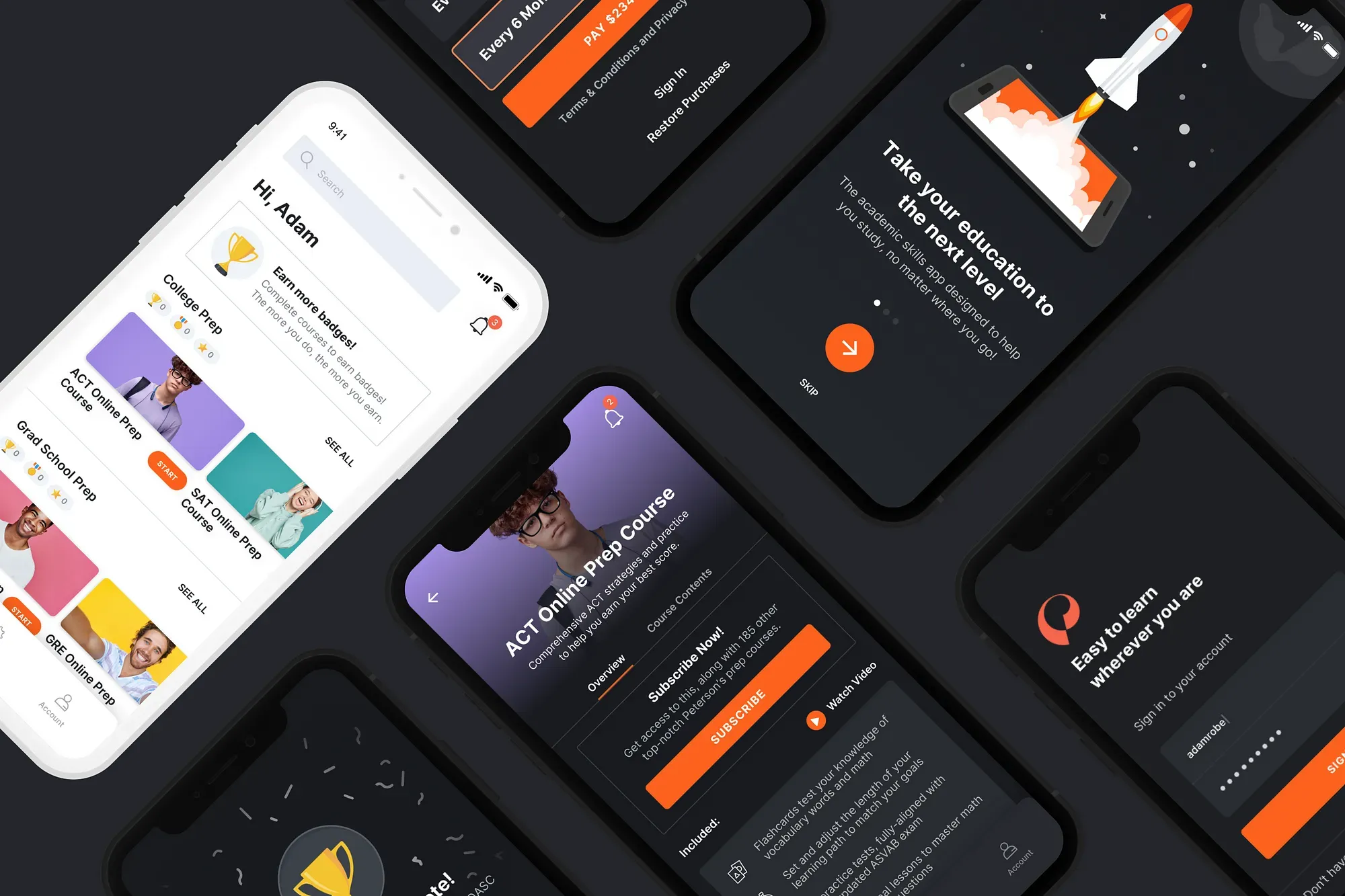
Peterson's Test Prep · 2020
Making test prep work on a phone
Two native apps, 185 courses, four months from ideation to launch — 4.6 stars and 10,000+ downloads in the first week.
- Role
- Design Lead
- Scope
- Native iOS and Android app design and development
- Team
- Design, iOS, Android engineering teams
- Timeline
- 4 months (ideation to launch)
Impact
4.6 stars, 10K+ downloads in week one
Shipped iOS and Android from ideation to launch in four months, after an outsourced attempt had failed.
DTC sales went $50K → ~$1M a year
The apps capped a four-year arc that started with replacing a Stripe form on a .NET site.
Designed around a constraint we could not remove
Course content was iframed webviews on another domain. I shipped a user-agent stylesheet switcher to make them look native — a workaround, and I would negotiate the constraint away next time.
Introduction
In 2017, Peterson’s DTC test prep sales were $50K a year. The “ecommerce experience” was a Stripe payment form on an outdated .NET site. After standing up a POC with WordPress, WooCommerce, and a minimally customized Storefront theme, sales grew to an estimated $1M by 2021. In Q2 2020, we decided to go native — iOS and Android apps to replace the default responsive LMS course content with something actually built for mobile.
Tech teams were put in place and I came in as design lead, after an unsatisfactory attempt by an outsourced designer. Four months to ideate, research, design, build, and test two native apps.
Design Methodology
On a new project I start with design thinking, gathering generative research through empathy and a deeper understanding of user needs and desires. From there I combine systems and design thinking through evaluating, defining, and developing the product — big picture first, specific interactions later.
What are the core components in the product? How are they connected? What does the overall purpose of these elements serve? Do they solve my persona’s problems? Understanding how the collective system inter-relates is what lets me design for the user journey and behaviour across the whole ecosystem, rather than screen by screen.
User Research
Who’s the target audience?
The 185 test prep courses Peterson’s offers cast a pretty large net on the target users. At the youngest, it’s 16–18-year-old prospective college students looking to improve their score on the ACT or SAT. Somewhere in the middle, it’s active-duty military personnel wanting to take the ASVAB to further their education. And at the oldest, it’s middle-aged professionals looking towards a second career in Real Estate.
The core problem
Test prep on mobile is hard — and with mobile usage increasing, inevitable. You’re dealing with complex math equations, lengthy passages, and interactive course content, none of which are easy to render well on a phone screen. None of our direct competitors offered a good experience. There are specialist apps like Duolingo, Masterclass, and Treehouse with splendid interfaces, but those barely touch the surface of what Peterson’s offers: 185 courses across dozens of test types. The goal was to make it easy — and rewarding — for users to move through that content on a phone.
Competitive Analysis
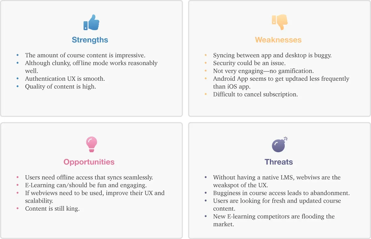
To gain a better understanding of the market, I did an analysis of our primary competitor — Coursera. I build a SWOT profile and conducted a UX analysis of their product. My key findings were:
- While functional, the design wasn’t engaging.
- While offline courses worked, many of the negative reviews were attributed to syncing bugginess.
- The breadth of content was impressive.
- Account management was difficult to use since it’s outside of the scope of the Apple/Google Play subscription management service.
- It was apparent that Coursera also used webviews for much of their content, and the difference between native and webview content was noticeable.
User Personas
Based on the generative user research I gathered, I identified three target users to help understand their goals and expectations from the experience of using the app. Meet June, David, and Frank.

June: 16-year-old high school student
June is looking to attend a good college. Her first attempt at the ACT wasn’t quite enough to get her there. One of her best friends used Petersons’ printed guide to increase his score by 5 points. June feels like she learns better digitally and opts for the online guide. June is hoping to chip away at the course content throughout the day as she goes about her already busy school/extracurricular schedule.
David: 22-year-old Army servicemember
David has aspirations of furthering his education and going to college for Criminology after his duty in the Army. He’s interested in taking the ASVAB to get a head start on his education. He’s deployed in Afghanistan so there are long stretches where he doesn’t have internet access. Offline test-taking would help him prepare at his pace during these long stretches.
Frank: 40-year-old electrician
Frank has been an electrician for nearly 20 years. He’s seen the recent surge in house flipping and the subsequent need for real estate agents. He even wouldn’t mind taking his shot at flipping sometime in the future. To start, he figured getting his real estate license would be a good first step. His schedule is busy though, so he’d like a way to study on his phone during the day (between jobs) that would sync to his computer for night sessions.
Define and Synthesize
Problem statement
Users need a way to access Peterson’s quality test prep content from their mobile devices because they are busy and often find themselves on their phones instead of a laptop or desktop. Both the subscription and the course content experience need to be easy and approachable. Content needs to sync across devices.
Hypothesis
The current mobile responsive ecommerce experience is cumbersome at best. Despite that, 60% of our test prep users study on their mobile devices. This app will lead to higher customer satisfaction, more engagement, and greater sales.
Solution
- Design both a native iOS and Android app that lets the user purchase, access, and manage a test prep subscription.
- Use Auth0 for SSO authentication so user data syncs across platforms.
- Integrate course content as webviews so the course data stays in sync across platforms.
- Implement a reward/badge system to encourage engagement through longer, more laborious courses.
- Adhere to Apple’s Human Interface Guidelines and Android’s Design Guidelines while maintaining a fresh imagination.
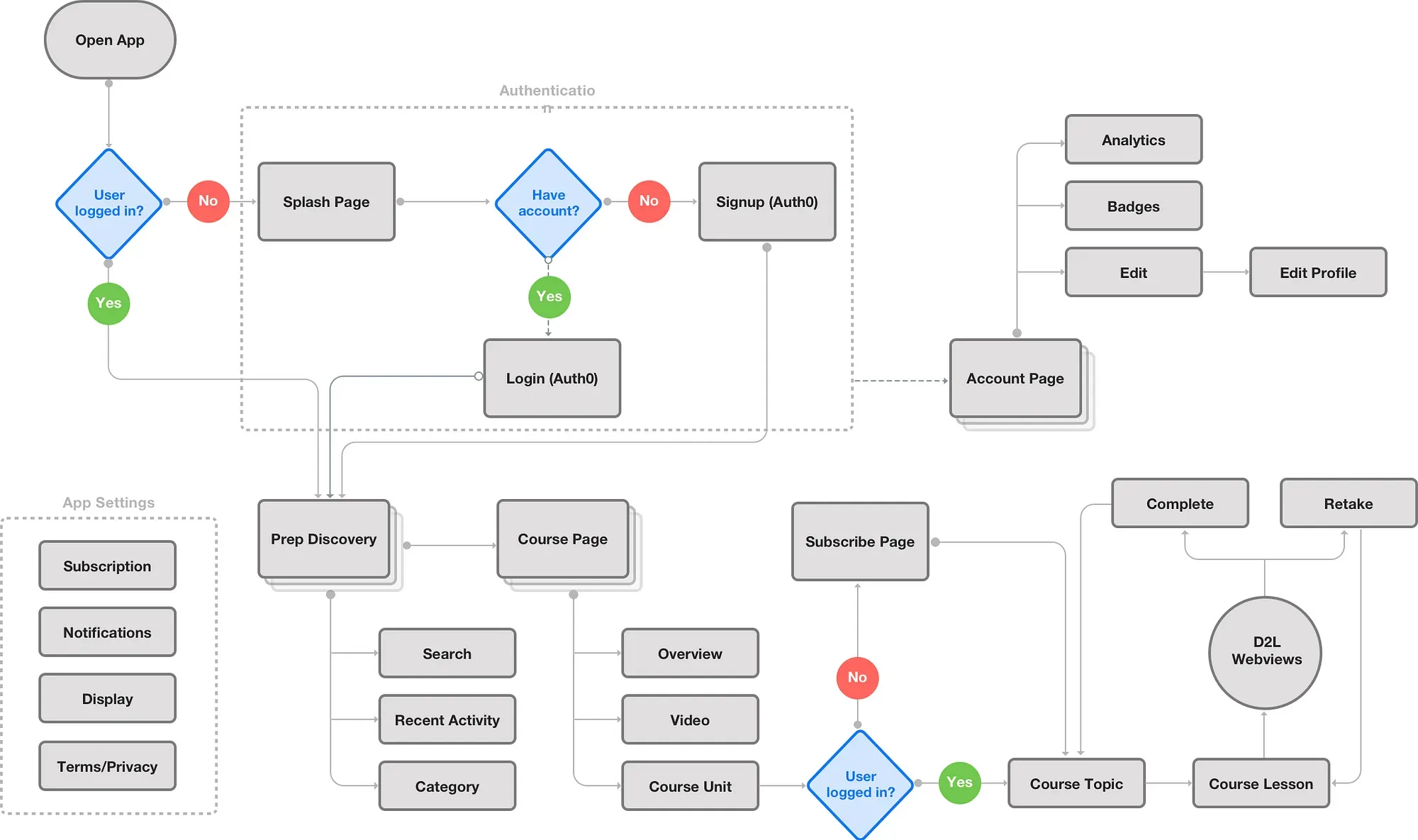
User Flows
Leveraging research on customers’ needs, competitor analysis, and mobile best practices, I build a user flow that was used to guide the lifecycle of product development.
Wireframes
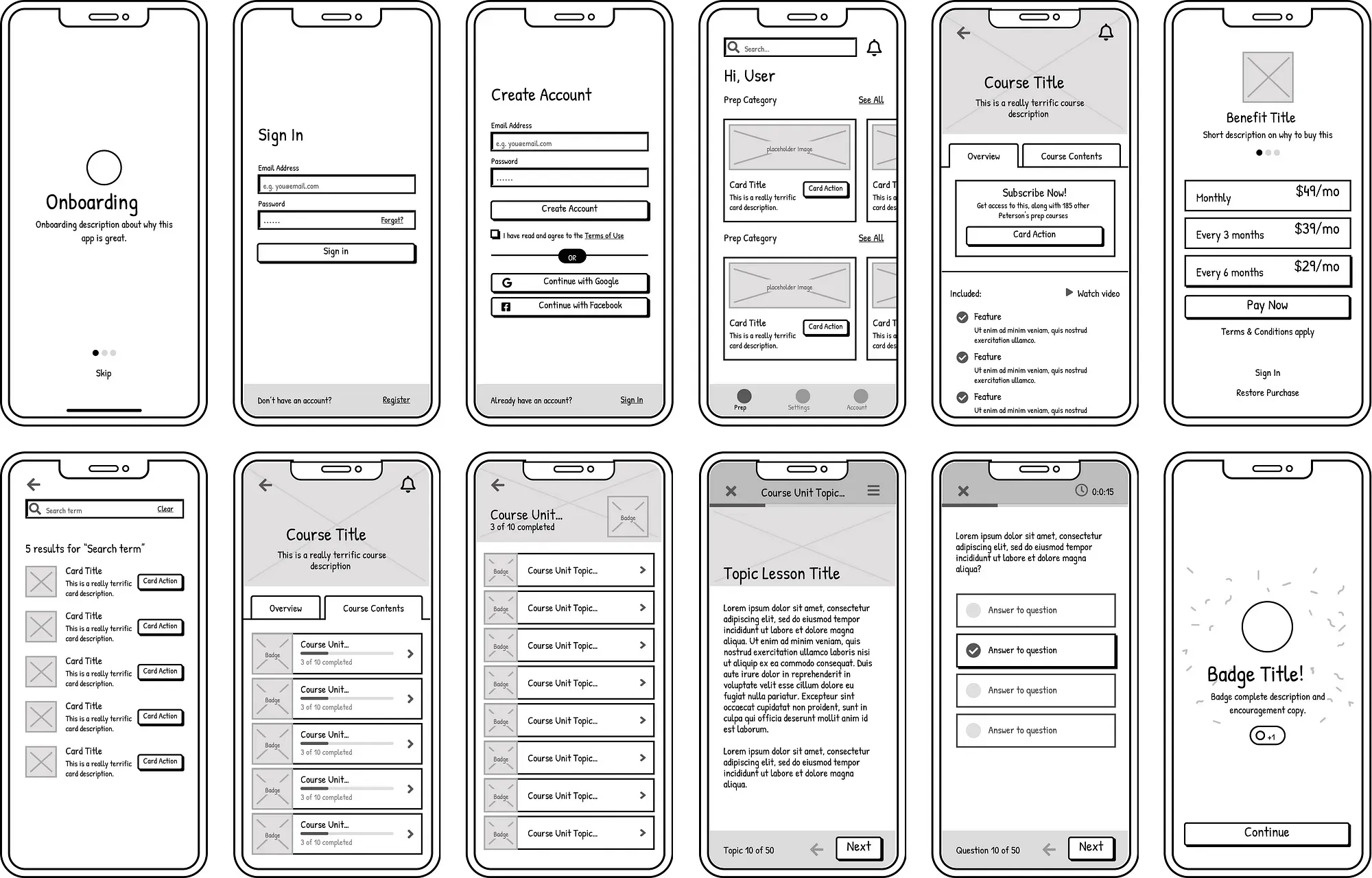
We ran daily design calls during this phase to iterate and approve screens — some took 15 minutes, others ran two hours. I tested the wireframe prototype with 3 participants to validate direction before moving to high fidelity.
Design System
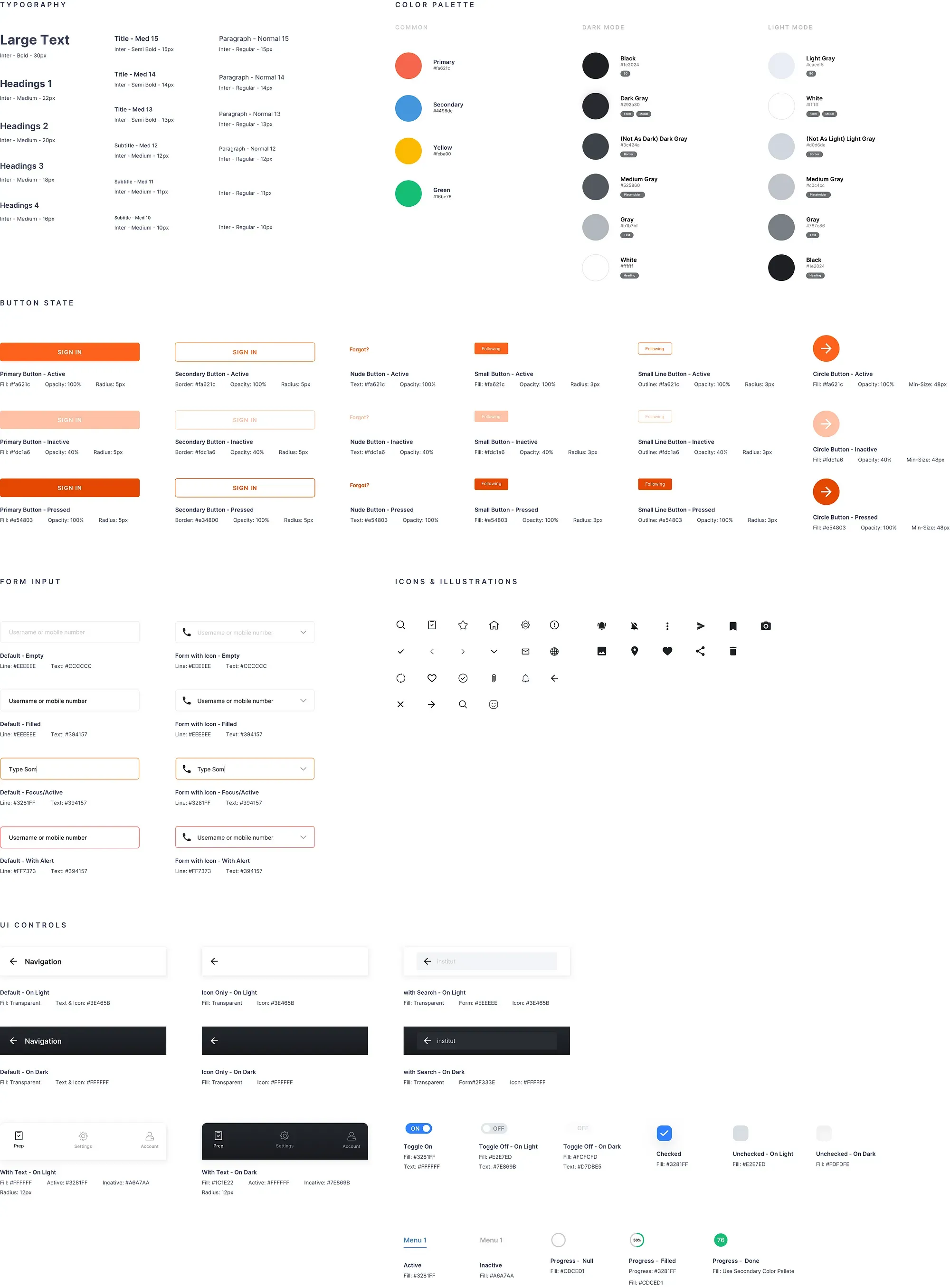
The design system was built as part of the component library in Sketch, along with the ability to export it to Zeplin. Inter was used for all typography, colors were identified as dark vs. light mode, and most non-native UI components were accounted for.
Final Design
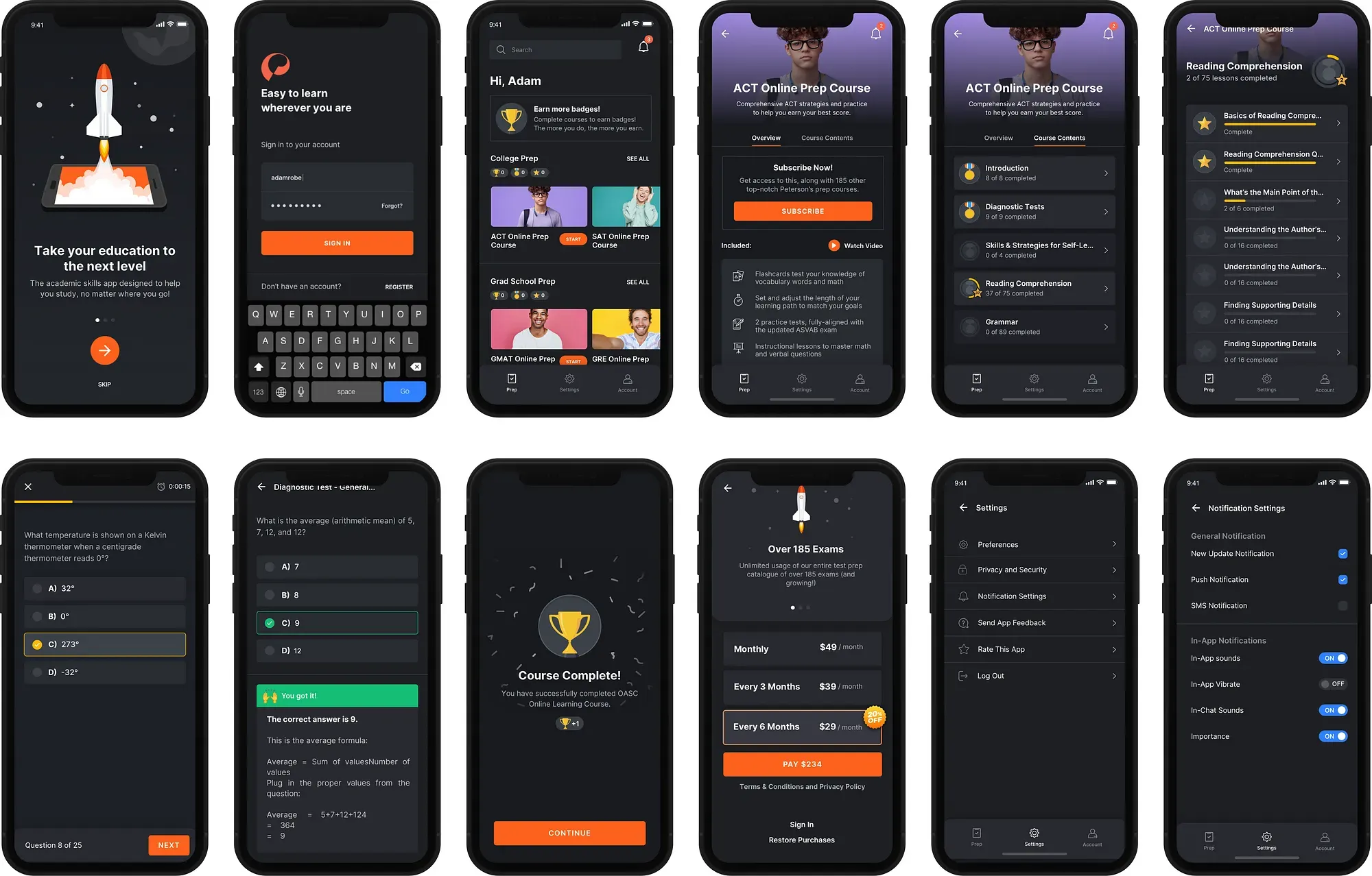
The design prioritized flexibility (185 different course types need to feel at home in the same shell), clarity, and a friendly tone that made test prep feel less intimidating. Both light and dark mode were fully designed, following Apple’s HIG and Android’s guidelines throughout.
Where the alpha broke down
Once we had an alpha of the app based on the final designs, I ran two rounds of user testing on usertesting.com. I wrote the acceptance criteria for candidates, and within a day we had a handful of testers. After combing through hours of video, I quickly started to draw conclusions:
- Our pseudo-native implementation of Auth0 was a hit. Users commented on how smoothly it worked.
- Users loved the dark and modern look of the app.
- Overall, it was easy to create an account, find a course, and start it.
Not all feedback was positive. Once into a course, users griped about how clunky the experience was. The actual course content was being served as webviews directly from D2L’s Brightspace. And sadly, Brightspace used iFrames to insert content. Due to cross-origin policy and Brightspace being on another domain, we had little control over styling the course content. Also, because of this, the light and dark mode toggling wasn’t working.
Designing around a constraint I couldn’t remove
Two of the most challenging technical aspects were:
- Since we’re using Auth0 for SSO authentication, designing the hosted Auth0 login and signup pages to reflect the app both visually and functionally. Because of this, I wrote a custom UI switcher in JS that served up a completely optimized app experience via JS and CSS. After two rounds of user testing, applicants didn’t notice that the login and signup weren’t native experiences and actually commented on smooth the UI was.
- Since actual course content was being served as webviews, I needed to find a way to style them that wouldn’t adversely affect the desktop and mobile responsive views. While D2L looks okay on desktop, it certainly didn’t carry the same sexy visuals as the new app. Additionally, light and dark mode didn’t work. Again, I wrote a little JS to detect the user agent, and if it matches iOS or Android native, I served a specific stylesheet. I was also able to use the
prefers-color-schememedia query and standard CSS variables to easily toggle dark and light modes.
Production JS
function loadCSS() {
  var userAgent = window.navigator.userAgent.toLowerCase(),
    safari = /safari/.test(userAgent),
    ios = /iphone|ipod|ipad/.test(userAgent),
    android = /wv/.test(userAgent);
  if ((ios && !safari) || android) {
    document
      .getElementsByTagName('head')[0]
      .insertAdjacentHTML(
        'beforeend',
        '<link rel="stylesheet" href="https://learn.petersons.com/shared/HTML-Template-Library/HTML-Templates-V3/assets/css/app-styles.css">'
      );
  }
}
document.addEventListener('DOMContentLoaded', loadCSS);
Production CSS
/* Light mode (default) */
:root {
  --h-color: #1e2024;
  --p-color: #383b3e;
  --bg-color: #ffffff;
  --border-color: #d0d6de;
  --box-shadow-color: rgba(0, 5, 10, 0.1);
}
/* Dark mode */
@media (prefers-color-scheme: dark) {
  :root {
    --h-color: #fff;
    --p-color: #b1b7bf;
    --bg-color: #292a2e;
    --border-color: #3c424a;
    --box-shadow-color: rgba(0, 5, 10, 0.08);
  }
}
Outcomes and Reflection
The app launched to a 4.6-star rating and 10K+ downloads in the first week. More importantly, it supported the broader growth story — Peterson’s DTC test prep sales hit an estimated $1M annually, up from $50K just a few years earlier.
The biggest constraint was the webview layer. Brightspace’s iframe-based content and cross-origin restrictions meant we were always working around limitations rather than designing freely. The Auth0 and dark mode workarounds I built were effective, but they were workarounds. If I could go back, I’d push harder in the planning phase to negotiate more control over how course content was rendered in-app, even if that meant a longer timeline.
The personas held up well. June’s “chip away throughout the day” use case directly informed the reward system. David’s offline needs shaped how we thought about content caching. And Frank’s cross-device syncing requirement validated the Auth0/SSO decision early on.
- 4.6
- Star Rating
- 10K+
- Downloads First Week
- $1M
- Annual DTC Sales
- 4
- Months To Launch
To see the current Peterson's platform, visit www.petersons.com
Next project